Showing posts with label Toulouse-Lautrec (Henri de). Show all posts

Wednesday, April 22, 2009

In Living Color


There’s a great moment in The Wizard of Oz when Dorothy opens the door to the black-and-white Kansas farmhouse after the twister sets it down and finds a whole Technicolor Land of Oz outside. I can only imagine how breathtaking the color was to audiences in 1939, but I know that I paid great attention when I first saw it as a kid. A similar phenomenon happened in the career of Odilon Redon. Born April 22, 1840, Redon excelled as a draftsman. His father pressured him to become an architect, but Redon longed to draw the fantasies dancing in his head. A fan of Edgar Allen Poe and other authors of the bizarre, Redon drew mind-boggling works such as Eye-Balloon (above, from 1878) almost exclusively in black and white. It was as if the images themselves were so powerful that he couldn’t comprehend them in living color at the same time. Like many hard-to-fathom visionaries, Redon languished in relative obscurity until 1884, when Joris-Karl Huysmans’ novel À rebours (Against Nature) featured an aristocrat who collected Redon's drawings. Huysmans descriptions of Redon’s art created an instant demand among connoisseurs of the avant garde. But just as Redon hit the big time in black and white, he decided to branch out into living color.


From the 1890s on, Redon painted some of the most eye-popping pastels and oils of any artist working at the time. Henri Matisse and the Fauves would look to Redon’s use of color as a model for their own art. Redon’s Saint John (above, from 1892) shows just how Redon could achieve breathtakingly saturated blues. Matisse claimed that he found in skies and waters of the south of France the blue he’d been looking for all his life, but Redon’s blues must have come a close second. As amazing as the blue of Saint John appears in reproduction, I’m sure it’s even more powerful in person. I recall seeing some pastels by Redon at the Musee d’Orsay and mentally comparing them to those by Degas and Toulouse-Lautrec nearby. Although they were all near contemporaries, Degas and Toulouse-Lautrec are much more into gesture than Redon, who builds up his images with a great deal of density. Next to Degas, Redon seems almost ponderous. Degas colors actually seem to move and vibrate, whereas Redon’s colors seem impossibly still, almost as contemplative as Saint John appears to be here.


Whether in black and white or color, Redon’s strange imagery never seems sinister the way that Alfred Kubin’s or Leon Spillaert’s does. Maybe that is because Redon worked mostly before Freud gave form to much of the mental angst at the beginning the twentieth century. After Freud, Kubin and Spillaert could give free reign to their deepest demons. Redon never really gets that dark, even in his early black and white work. When you look at Redon’s Flower Clouds (above, from 1903) you get a warm and fuzzy feeling, something certainly Kubin never gives you. Redon finds himself lumped in with the Symbolists for lack of a better label, but he’s really beyond category. To me, Redon always is about possibility. You see people standing and actually believe you can see them thinking, as with Saint John. With Flower Clouds and other ship-related paintings, you always wish you could know the mariners’ final destination. When European modern art reached American shores in the 1913 Armory Show, Redon, not Matisse or Picasso, had the largest number of works on display. In an exhibition aiming at showing the newest possibilities in art, Redon was the perfect choice.

Thursday, October 9, 2008

Born to Sell


Ateliers Cheret (Jules Cheret and Georges Meunier), Specimen d’affiches artistiques, “Les Maitres de l’affiche,” 1895.

Assaulted by advertising images everywhere we look today, it’s hard to imagine a world not dominated by commercial imagery. The cartoonishly crowded look of ads plastered over every inch of racecars threatens to become the norm as America morphs into NASCAR nation. Advertising and Art: International Graphics from the affiche to Pop Art, edited by Claudio Salsi, helps us imagine a simpler time, when advertising art was just beginning to develop, and shows us how we got to where we are today. Delving into the mammoth print and poster collection of the Civica Raccolta delle Stampe “A. Bertarelli”, a team of Italian art historians trace the history of the advertising poster from the very beginning, starting with Jules Cheret,the “father” of the modern advertising poster. Cheret’s work (above) seems almost quaint by today’s brash standard, but it proved influential on more experimental graphic artists such as Henri de Toulouse-Lautrec. As Giovanna Ginex explains in her essay, by the end of the nineteenth century, “[p]oster design became a profession” with “specialist printing houses” and “cities changed their appearance, welcoming—more or less knowingly—advertising material in their ‘modern’ urban fashioning.” Thanks to Cheret and others, advertising art grew from a poorly regarded corner of the art world to a new, distinct outlet for visual expression vitally linked to everyday, commercial life.

Alfons Mucha, Bisquit Dubouche & C. Cognac, 1899.

Advances in chromolithography removed the limitations of lithography, thus “leaving the artists’ prerogatives almost intact and rather bringing out their creativity,” Ginex asserts. The freedom to realize in reproduction almost anything they could paint attracts a new class of artists, including Alfons Mucha (above), who revolutionizes the look of the advertising poster, introducing elements of Art Nouveau into the common existence of European society and infecting every corner with a passion for that style so easily adapted to furniture, architecture, etc. Over time, the center of advertising visual innovation moves to Munich, where the Jugendstil branch of Art Nouveau flourishes. Thanks to the Raccolta Bertarelli’s vast collection to draw from, Advertising and Art supports each of its essays with a rich set of examples that show not only the well-known figures such as Mucha but also lesser-known but no less talented artists working in the field. These are commercials you don’t wish you could fast forward through.
Leopoldo Metlicovitz, Inaugurazione del Sempione. Esposizione Internazionale Milano 1906, 1906.

Much like early photography, early advertising found itself emulating the world of painting until it could develop a distinct language of its own. The work of Leopoldo Metlicovitz (above) shows how advertising art continued to resemble painting in terms of composition and style, perhaps even more so thanks to technological progress solving earlier problems in reproduction. At the same time, artists such as Leonetto Cappiello actively sought that new language for advertising. “The art of the poster has its own requirements and its own laws,” Cappiello said. “If the poster is good and successful, it is commercial and artistic, otherwise it is not a poster.” Giovanna Muri, in her essay on the poster’s development in the 1920s and 1930s, sees the influence of the Italian Futurists on the poster in a give and take process. “Futurist poetics.. not only used the means of advertising communication to promote the value of dynamism, progress, and technology, but also attributed a fundamental prominence to advertising as artistic experience,” Muri writes. Futurism lends only one of the many art dialects that merged into the larger language of advertising art taking shape in the first half of the twentieth century.


Nikolaj Petrovich Prusakov, The Calm Waters of the Volga, 1925.

Russian Constructivism and the vision of Alexander Rodchenko also played a role in the development of advertising art in Europe. When the new Russian cinema crossed Europe, it came twinned with equally new, striking advertising posters. Nikolaj Petrovich Prusakov’s poster for the film, The Calm Waters of the Volga (above, from 1925) stands as just one example of the new visual display of Russian Constructivism, which opened up another realm of possibility for advertising artists. In the 1920s a bevy of advertising-related specialist magazines emerged. Alessia Alberti examines in her essay the influence of those magazines on the industry and how they helped create the first advertising agencies as we know them today. Finally, the advertising world had finally broken free of the art world as a separate entity, yet it continued to borrow from the art world as the art world began to borrow from it.

Giovanni Pintori, Olivetti, 1953.

The years just before, during, and after World War II significantly changed the landscape of advertising art. As Anna Steiner points out in her essay on advertising from the 1930s to 1968, the techniques of Fascist and Nazi propaganda quickly crept into mainstream advertising imagery. “No strong difference was noticeable between advertising and cultural propaganda” after the war, Steiner writes. Members of the Bauhaus preached a new all-encompassing type of art that spread to America as Walter Gropius, Ludwig Mies van der Rohe, and others fled Nazi oppression and took up teaching jobs. Scientific research on human behavior reveals that certain colors such as red more effectively reach the eye, spurring artists such as Giovanni Pintori to sprinkle red among the other colors of his 1953 poster for Olivetti typewriters (above). New fonts such as Helvetica come on the scene and suddenly define the “look” of a generation. As advertising’s language not only grew up but eventually grew amazingly powerful, artists in the conventional art world took note. The Pop Art movement of Andy Warhol, Roy Lichtenstein, Richard Hamilton, and others all addressed how the advertising world intersected with the “real” world. “The real is not ‘realism,’” Francesco Tedeschi writes in his essay, “The Phantasm of Reality: Advertising in the Art of the 1960s,” “but consists in the iconosphere and in the landscape determined and produced by the social and sociological dimensions of a reality made of images, commodities, and consumptions. It is not a matter of seeking a language that speaks to the masses, but of appropriating the language of the society of mass consumption.” The relationship had finally come full circle. In less than a century, where advertising had once emulated art, art now emulated advertising for its connection to the “real,” and what that might actually mean.

Leopoldo Metlicovitz, Madama Butterfly, 1904.

Advertising and Art provides a concise crash course in the development of advertising imagery over the last century. Part of me longs for the days of beautiful works such as Leopoldo Metlicovitz’s poster for the premier of Puccini’s Madama Butterfly in 1904 (above), but the eventual separation between mainstream art and a distinct sphere of advertising proved mutually beneficial to both parties. Today’s fast-paced, television-driven advertising world no longer places a priority on print campaigns, but Advertising and Art keeps its priorities straight and provides a straightforward assessment of the long, strange trip advertising art has taken in finding a voice of its own.

[Many thanks to Rizzoli for providing me with a review copy of Advertising and Art: International Graphics from the affiche to Pop Art and for the images from the book.]

Friday, October 3, 2008

Champagne Wishes


After studying the law and practicing for some time as a lawyer, as his father wished, Pierre Bonnard finally put the art classes he had been taking on the side to use and decided to become an artist. Born October 3, 1867, Bonnard searched for his big break, which came in 1899 when he received the commission to design a poster for France-Champagne (above). Bonnard’s Japonisme-influenced depiction of bubbly effervescently teeming over the brim of the glass captured the imagination of a generation of French graphic artists, including Henri de Toulouse-Lautrec, who mimicked Bonnard’s style and became Bonnard’s friend in 1891. With the money he made from this poster, Bonnard finally quit his law job and became a full-time artist. “Our generation always sought to link art with life,” Bonnard said years later. “At that time, I personally envisaged a popular art that had everyday applications.” Bonnard’s calligraphic lines with their flowing movement helped usher in the age of Art Nouveau, which dreamed of bringing art into every facet of everyday life.


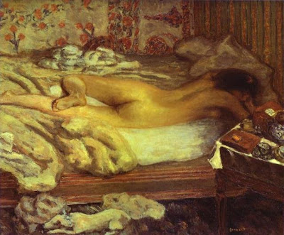
Bonnard interacted with many of the Impressionists of his day. Siesta (above, from 1899), one of many paintings in which Bonnard used his young wife as a model, shows the influence of Edgar Degas and his treatment of the female form. Bonnard helped found the group Les Nabis in the 1890s. Following the philosophy of Paul Gauguin if not Gauguin’s specific technique, Bonnard and others looked to infuse the subjects of Impressionism, such as the female nude, with a sense of spirituality and awe. In works such as Siesta and Indolence (also 1899), Bonnard transforms the nude female body into a religious artifact, literally pulsating with energetic color. The same primal force Gauguin found in the woman of the islands Bonnard found in the women of France, specifically his beloved wife.


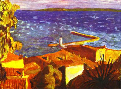
In 1926, Bonnard moved to the French Riviera, where he remained for the rest of his life. Works such as Landing Stage (above, from 1938-1939) show Bonnard’s love for the blue skies and water of the Riviera—the blue that Henri Matisse claimed he had been searching for all his life. Although Bonnard opened up his palette to a whole new world of color, he never embraced Fauvism or any other new art movement of the first half of the twentieth century. Bonnard carried on in his personalized Post-Impressionist fashion until his death in 1947, five years after the passing of his beloved wife. It’s hard to think of Impressionism stretching past the horror of Nazism and World War II, but Bonnard outlived even those movements in history. Like a fine bottle of champagne, Bonnard kept bubbling along and never stopped being the life of the party.

Wednesday, September 24, 2008

After the Fall


When she was fifteen and working as an acrobat in a circus, Suzanne Valadon fell from a high trapeze and ended her career under the big top. Born September 23, 1865, Valadon soon found a new purpose for her beauty and athletic build—modeling for the great artists of France. Henri de Toulouse-Lautrec, Pierre-Auguste Renoir, Pierre-Cécile Puvis de Chavannes, and many other artists soon immortalized Valadon again and again. (Toulouse-Lautrec’s Portrait of Suzanne Valadon appears above.) Valadon soon became more than a model, having affairs with both Renoir and Puvis de Chavannes, among others. She gave birth, perhaps from one of these liaisons, to a son who would one day become the artist known as Maurice Utrillo, fueling rumors that the father had to be one of the great artists. After progressing from model to lover, Valadon soon enticed these artists to show her how to paint. Edgar Degas, for whom Valadon never modeled and never entangled romantically with, encouraged Valadon’s efforts and showed her techniques of drawing and pastels. From humble beginnings, Valadon soon found herself in select artistic circles.


Of all the artists Valadon worked with, Degas seems to have had the greatest influence. Valadon drew and painted countless Degas-esque nudes, as in After the Bath (above, from 1908). Although her drawing technique differs from that of Degas, Valadon’s choice of subject matter clearly links her to Degas. Valadon even uses many of the unconventional poses Degas placed his female nudes into, accentuating the curves and lines produced in those awkward, unguarded moments. Looking at a work such as After the Bath, you see some of the possibilities that Degas never explored in his pursuit of other experiments. Valadon never creates the dizzying, almost pulsating pastels Degas mastered, but her simplicity of line and flat color seem like prophesies of the later work of the Fauves or even the early Pablo Picasso.


Valadon never lost her allure for men. Even the almost asexual classical composer Erik Satie fell for Valadon, and fell hard. Satie proposed to Valadon on their first date. Although she never married Satie, she did run through a series of husbands as she continued to mature as an artist and develop her own style. The nudes of her Degas-influenced period gave way in the twentieth century to still lifes with flowers and landscapes such as View from My Window in Genets (Brittany) (above, from 1922). The first woman painter admitted to the Société Nationale des Beaux-Arts, Valadon broke new ground for women in the still male-dominated art French art world and earned the respect of several generations of male artists. Picasso, Andre Derain, Georges Braque, and other artists attended her funeral in 1938, paying their respects to a unique figure in French painting of the late nineteenth and early twentieth century—a woman who knew life from both sides of the easel and acrobatically leapt over every obstacle on her way to the top.

Monday, August 25, 2008

Showtime


Around Christmastime 1894, Alfons Mucha dropped into a Parisian print shop and found his life changed forever. Someone from the Theatre de la Renaissance confronted the print shop owner with a sudden demand for an advertising poster for the new play Gismonda starring famed actress Sarah Bernhardt. Mucha, seeing the opportunity of a lifetime, interjected that he could deliver the poster in two weeks. Two weeks later, Mucha poster of Sarah Bernhardt as Gismonda (above, from 1894) announced to the world his jaw-dropping talent. Born August 24, 1860, Mucha had lingered in relative obscurity since moving to Paris in 1887 from his native Morovia (now the Czech Republic), but the Gismonda poster soon became the toast of the city. Rivaling graphic artists such as Henri de Toulouse-Lautrec, Mucha soon became one of the most in-demand artists for advertising and caught the eye of the actress herself, who thereafter requested that her image be shaped by Mucha’s eye.


Every year, I buy for Annie calendars of the art of Mucha and John Singer Sargent, two of her favorite artists whom she never tires of seeing grace her office walls. Mucha brings an organic life and explosively blooming color to the style known as Art Nouveau. Aubrey Beardsley helped imagine the Art Nouveau line that makes that style so distinctive, but Mucha brought it to the public’s attention and made it the style of choice like no other artist. Mucha helped sell everything from perfume to chocolates with his images, usually of dreamily beautiful women looking wistfully off into the distance. Mucha’s poster for an event in honor of Sarah Bernhardt (above, from 1896) shows how he could make even hair come alive into a vast swarm of tendrils. I find Mucha’s work so infectiously engaging because of his endless ability to make even the most mundane detail pop with abundance.


Mucha’s work followed Bernhadt as she tore through the classic works of Shakespeare, including Hamlet (above, from 1899), in which she herself played the troubled prince. Although so much of Mucha’s work speaks of beauty and joy, he never lost that Slavic sense of national struggle and pride in that struggle. When his native Czechoslovakia won independence after World War I, Mucha designed the stamps, currency, and government documents for the new nation. Mucha later painted twenty mammoth canvases following the history of the Czech and Slavic people, which he called The Slav Epic and donated to the people of Prague in 1928. Sadly, the same pride that made Mucha literally the painter of his people, made him a target when the Nazis invaded in 1939 and took the aging artist into custody. The shock of the experience quickly led to Mucha’s death. Despite the Nazis’ ban on a state funeral, the Czech people staged a grand farewell to Mucha, a final curtain call for an artist who starred on both the small and the grand stages of history.

Wednesday, July 30, 2008

Sibling Rivalry


What must it have been like growing up the brother of Marcel Duchamp? Gaston Duchamp, better known as Jacques Villon, must have felt overshadowed at times by his little brother, twelve years his junior. Born July 31, 1875, Villon took his new name in honor of French poet François Villon and set out to create his own type of poetry separate from that of his famous sibling Marcel and his lesser-known artistic siblings Raymond and Suzanne. In prints such as The Cards (above, from 1903), Villon shows his debt to the works of Henri de Toulouse-Lautrec, whose stunning graphic style swept through Europe and changed the way Villon and other graphic artists who followed went about their work. While Marcel delved into the deep thought experiments of Dada and Surrealism, Villon traveled in Fauvist, Cubist, and Abstract Impressionist circles, slowly moving away from the Post-Impressionism of Toulouse-Lautrec to a more modern look.


Villon excelled at printmaking and etching. The Checker Table (above, from 1920) shows Villon trying his hand at Cubist etching. (I wonder if Villon and Marcel, famous for his love of chess, ever squared off over a board or two.) The board and the table it rests on seem to be disassembling themselves off into space, much like Marcel’s Nude Descending a Staircase, No. 2 painted eight years earlier. Like Marcel and so many other European artists, the 1913 Armory Show served as a coming out party for Villon, introducing his art to an American audience for the first time. While some of those artists met resistance from the American markets, Villon found a second home and acceptance for his more accessible Cubist works such as The Checker Table.


While Marcel always seemed to be an art movement unto himself, always wary of labels and the very nature of institutionalized art itself, Villon seems more at home in groups, helping others find an audience. Although Marcel and Raymond also helped form the Puteaux Group that included Francis Picabia, Robert Delaunay, and Fernand Leger, Villon more than his brothers organized the Section d'Or exhibitions that brought those innovative artists to the public eye. In Villon’s Self-Portrait from the 1950s (above), he seems almost forbidding, perhaps poking fun at his open, inviting character. Marcel always seems to be in exile from himself and art, while Villon always seems secure in his place in the world and art-making. Perhaps the younger brother could have learned a few things from his older brother. Just the choice of the graphic medium, with its easy reproduction and often illustrative nature, speaks of Villon’s greater desire to communicate in contrast to his still-befuddling, often overshadowing younger brother.

Tuesday, July 15, 2008

Technical Knock Out

George Bellows. Introducing Georges Carpentier, July 1921. Crayon with touches of pale brown wash on smooth, dark cream, wove one ply card stock. Wiggin Collection, Boston Public Library.

On July 2, 1921, French boxing champion and World War I hero Georges Carpentier squared off against American Jack Dempsey, whom the American crowd booed as a “draft dodger” for not fighting in the war. George Bellows, the great American illustrator known best for his boxing images, sat in the crowd and chose to depict the moment (above) when the American crowd cheered the Frenchman as Dempsey sat in his corner getting his hands taped up to knock Carpentier out in the fourth round. In the current exhibition at the San Antonio Museum of Art, The Powerful Hand of George Bellows: Drawings from the Boston Public Library, we see George Bellows not just as the painter of athletes but as a truly diverse artist who captured the entire American scene with a technical proficiency in printmaking and lithography few other American artists could match in the first half of the twentieth century.

George Bellows. Preaching (Billy Sunday), March 1915. Crayon, pen and ink, brush and ink wash on paper. Wiggin Collection, Boston Public Library.

Robert Conway, curator of the exhibition, examines Bellows’ career as a graphic artist in an exhaustive essay to the catalogue. Conway sees Bellows pursuing parallel careers as a painter and an illustrator, a path many of the Ashcan School artists took not only to pay the bills but also to fulfill their ideological quest to bridge “the artificial separation between the concerns of fine art and the subject matter of popular culture.” Thanks to the diversity of the Wiggin Collection at the Boston Public Library, this exhibition traces the evolution of many of the images from initial drawing to finished print, showing that Bellows often resurrected drawings from years before to use as print subjects. Still, many of Bellows’ drawings came from current events thanks to his work for newspapers, such as Preaching (Billy Sunday) (above). In January 1915, Bellows traveled to Philadelphia with journalist John Reed to cover Sunday’s “Christ for Philadelphia—Philadelphia for Christ” rally. Bellows captures Sunday at the height of action, almost leaping upon the rapt crowd beneath his pulpit. In contrast to the almost sinister Sunday, Bellows draws the faces of the crowd in a cartoonish, caricature style. “I like to paint Billy Sunday, not because I like him, but because I want to show the world what I do think of him,” Bellows later said. “Do you know, I believe Billy Sunday is the worst thing that ever happened to America? He is death to imagination, to spirituality, to art… His whole purpose is to force authority against beauty.” Such “reactionary” behavior by Sunday, Bellows claimed, forced him to be an “anarchist” in his art in order to save America and art itself from Sunday’s influence. In such works, Bellows rises to the order of Hogarth or Goya in terms of social content in a single striking image.


George Bellows. The Barricade, 1918. Crayon, varnished, on Strathmore Drawing Board. Wiggin Collection, Boston Public Library.

Conway condemns Bellows for allowing his “facility” overcome his “anarchist” tendencies too often. Bellows’ “engaging touch of humor kept him skating across the surface of the world he illustrated, only rarely digging into its substance… Unlike Goya, Hogarth, and Daumier, his distinguished predecessors, Bellows did not invest his satirical illustrations with the strength of his convictions.” I felt that Conway asked too much of works by Bellows made with clear humorous intent, misreading the Ashcan School philosophy of playfulness and pleasure-seeking so wonderfully examined in the Detroit Institute of Arts’ recent exhibition and catalogue Life’s Pleasures: The Ashcan Artists’ Brush with Leisure, 1895-1925 (reviewed here). Conway, however, does credit Bellows with courageousness in his series illustrating the German World War I atrocities in Belgium, including The Barricade (above), which shows German soldiers using innocent civilians as human shields. Conway tempers even that praise with criticism of the artfulness of the image, seeing Bellows’ use of the compositional theory known as “Dynamic Symmetry” as hindering Bellows’ natural gift for composition. Bellows believed “Dynamic Symmetry” to be “as profound as the law of the lever or the law of gravitation,” but Conway rightfully sees it as a self-imposed obstacle.
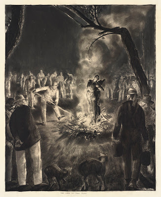

George Bellows. The Law Is Too Slow, Winter 1922-1923. Crayon on smooth, cream-colored, thick, wove paper, most likely Strathmore Drawing Board. Wiggin Collection, Boston Public Library.

Fortunately, over time, Bellows slowly slipped from under the influence of “Dynamic Symmetry” and allowed himself to follow his usually impeccable instincts. Through it all, Bellows “never lost his instinct for the right choice,” Conway writes. Perhaps the most strikingly “right” choice from the collection comes in the work The Law Is Too Slow (above), which depicts a vigilante killing in the 1920s, an all too familiar scene as the Ku Klux Klan rose to prominence within America. The central burning figure recalls the white-shirted man of Goya’s The Third of May, 1808 in its eye-arresting brilliance. The blood-thirsty crowd seems almost inhuman in their rough features as nature itself, in the form of the dark tree dominating the background, appears twisted by the injustice of their actions. Bellows’ personal thirst for justice comes through in the two-way title, which can be read as the rationale of the killers for taking justice into their own hands or as the lament of right-thinking people who mourn the death of an innocent man based solely on skin color.


George Bellows. Girl Sewing, Winter 1923. Crayon on lightweight cream wove paper. Wiggin Collection, Boston Public Library.

What makes the depictions of violence and injustice all the more striking are Bellows’ depictions of the joys of a simple home life, such as Girl Sewing (above), a portrait of his wife Emma. “You would not call him very affectionate,” a personal friend said of Bellows, “but he had a great deal of affection bottled up in him.” Such affection bubbles up in his drawings of his family, particularly of his children. Bellows died in 1925, only 43 years old, leaving behind a tantalizing glimpse of how much more he could have accomplished. The Powerful Hand of George Bellows demonstrates the technical prowess of Bellows as well as the complex mind and heart that guided that hand. In the Wiggins Collection, works by Durer, Rembrandt, Goya, Daumier, de Toulouse-Lautrec, and others rightfully take pride of place, but this exhibition and catalogue prove that George Bellows could stand toe to toe with any of them.


[Many thanks to the San Antonio Museum of Art for providing me with a review copy of The Powerful Hand of George Bellows: Drawings from the Boston Public Library and for the images above.]

Friday, June 20, 2008

Sketches of Spain


Whenever I see the name Leon Bonnat my mind instantly recalls that Thomas Eakins briefly studied under him in Paris before moving on to the studio of Jean-Leon Gerome. I’ve discussed Gerome’s influence on Eakins elsewhere, which is significant thanks to the greater amount of time they spent together, but I think Bonnat deserves some credit, too, for Eakins’ development. Born June 20, 1833 in France, Bonnat moved to Madrid, Spain, with his family as a teenager, and learned painting from Raimundo de Madrazo y Garreta, a successful Spanish portraitist. Madrazo taught in the classic Salon style, helping Bonnat develop strong draftsmanship, especially when it came to the human figure. Bonnat’s Jacob Wrestling With the Angel (above, from 1876) demonstrates Bonnat’s drawing skills and close attention to the human form in motion and under stress. I can’t help but look at Bonnat’s Jacob Wrestling With the Angel and think of all the wrestling images Eakins went on to paint and photograph.


While in Spain, Bonnat couldn’t possibly have avoided the influence of Velázquez, the guiding light for Madrazo and all the other Spanish realists and portraitists. One look at Bonnat’s portrait of the novelist Victor Hugo (above, from 1879) and you can recognize the signature dark background of the Velazquez portrait style as well as the deeply psychological probing of the depiction. Eakins made a pilgrimage to Spain to see the works of Velazquez after studying with Gerome. I’m sure Gerome knew and admired Velazquez, but it may have been Bonnat who first fired Eakins imagination with tales of the great Spaniard and then stoked them even further with his own Spanish-flavored portraiture. (A gallery of more portraits by Bonnat can be found here.)


Bonnat’s name has largely faded from the history of art, like so many of the generation of realists caught up in the whirlwind of new movements such as Impressionism that still dominate mainstream art consciousness today. William Coffin, one of Bonnat’s many American students, wrote a great tribute to his teacher in 1922 upon Bonnat’s death, detailing not only Bonnat’s great artistic talents, but also his generosity and humanitarianism. Like Gerome and other great artist-teachers of the late nineteenth century, Bonnat helped usher in the new wave of art that swamped them, teaching such early modernists as Gustave Caillebotte, Georges Braque, and Henri de Toulouse-Lautrec. At no point, however, did Bonnat feel like the Biblical Job he painted in 1900 (above), i.e., abandoned unreasonably by the art gods. While Gerome may have helped foster some of Eakins’ more radical ideas on the human body, I’d like to think that Bonnat taught Eakins some of the professionalism that helped Eakins endure (not always gracefully) “the slings and arrows of outrageous fortune” that those radical ideas invited.

Friday, May 23, 2008

Hungarian Rhapsody


At the end of the nineteenth century, artists from all over Europe flocked to Paris to learn and, perhaps more importantly, literally breathe in the new spirit of the arts. Traveling all the way from Hungary, Jozsef Rippl-Ronai lived in Paris from 1887 to 1901 before returning to his native land. While in Paris, Rippl-Ronai encountered many of the greats of Impressionism and Post-Impressionism. Born May 23, 1861, Rippl-Ronai’s Nude on a Balcony (above, from 1909) shows the influence of Edgar Degas’ nudes on Rippl-Ronai’s style. Rippl-Ronai knew Degas’ work quite well, eagerly listening to stories of the artist from his friend Henri de Toulouse-Lautrec, the only member of the younger artists’ circle brave enough to approach Degas. The shakiness of the line Rippl-Ronai uses in Nude on a Balcony, however, reflects the influence of Les Nabis, the “prophets” of modern art who based their art on the primal energy exemplified by Paul Gauguin, whom Rippl-Ronai met and championed when few others knew Gauguin’s work.


“He had recently returned for the first time from Tahiti,” Rippl-Ronai writes in his memoirs of his first meeting with Gauguin. “That is, he was already almost the real Gauguin.” Along with an artist friend, Rippl-Ronai learned “to love Gauguin's art, not every single item, naturally, but the artist as he was.” Spreading Gauguin’s around Paris, “where they either reviled him or thought he was mad,” Rippl-Ronai and his friend took credit as “the first to improve [Gauguin’s] reputation.” In Painter with Models (above, from 1910), Rippl-Ronai strikes a Gauguin-esque pose, placing himself among a gaggle of nude models just as Gauguin traveled to mingle with the scantily-clad Tahitian ladies. Rippl-Ronai clearly admired Gauguin “as he was,” and not necessarily Gauguin’s style of painting, hoping to emulate the antiestablishment radicalism that helped Gauguin break away from conventionality and find his true voice.


As much as Rippl-Ronai envied Gauguin’s freedom, he envied Degas for his technique. In Zorka (above, from 1923), Rippl-Ronai draws his favorite model in pastel, the medium Degas had almost single-handedly given respectability in the late nineteenth century. The nude woman’s unwavering stare at the viewer is pure Gauguin—shameless and powerful—but the stylized human figure, composed of pure gesture, reminds me of Degas’ later work featuring bathers in unconventional poses, configured more as abstract sculpture than living, breathing women. Gauguin and Les Nabis win credit for Rippl-Ronai’s bold palette and sensuous line, which won him fame upon his return to Hungary, but the influence of Degas, himself nearly blind when Rippl-Ronai encounters his work, clearly contributes to the eye-opening brilliance of the Hungarian’s art.

Wednesday, January 23, 2008

You Say You Want a Revolution


What could the 31-year-old Edouard Manet have been thinking during that tumultuous year of 1863? Born January 23, 1832, Manet had just completed The Luncheon on the Grass ("Le Déjeuner sur l'Herbe") (above, from 1862-1863) and Olympia (below, from 1863). After failing to get The Luncheon exhibited at the 1863 Paris Salon, Manet turned to the Salon des Refuses and fired the first shot against academic painting in the war that would lead to Impressionism and all modern art. The Luncheon (which I always find odd for the juxtaposition of the fully clothed men eating with the stark naked ladies) caused the first scandal of Manet’s career and marked him as an outsider, something he never wanted to be. Forced to lead a revolution he never wanted to begin, Manet became the inspiration for an entire generation of artists yearning to be free to paint any way they wished.


Oddly enough, the Paris Salon accepted Manet’s Olympia (above) the next year, perhaps hoping to cool down the flames of dissent by allowing Manet to exhibit and face critical appraisal. The woman in Olympia looks out at the viewer with an unflinching gaze, proud and unashamed of her nude body (and of her suggested profession of prostitution). Manet took the idea of the classical nude and placed it in a contemporary context, stripping away the façade of mythology and making a further joke of that façade with his title. Showing his love of Velazquez and the Old Masters, Manet paints Olympia realistically, yet strikes the first note in the symphony of modernism that would follow. Like his friend, the realist novelist Emile Zola, Manet strove to bring the real life around him into his art, regardless of the standards of the time. Seeing both The Luncheon and Olympia at the Musee D’Orsay was a memorable experience for me, but I can’t imagine the shock they delivered back in 1863.


Technically, Manet was a master. A Bar at the Folies-Bergère (above, 1882), with its amazing panoramic mirrored view of the bar “behind” the viewer standing in front of the painting, matches any illusionary effect done before or since. Amazingly, Manet literally places you within the world of the café, amidst the loud conversation, music, and human traffic that Manet himself knew so well in his travels. Toulouse-Lautrec and others depicted the bustling café scene of that era from the vantage point of an observer, but only Manet gives the impression of being wholly within the flow of life of such places. The barmaid in the painting actually seems poised to take your order. Manet is the ultimate transitional figure in art—a realist painter who thought like an Impressionist in wanting to place the vibrancy of modern existence on canvas. To the Impressionists, Manet served as a founding father, providing the courageous example that they followed in their own revolution.

Wednesday, January 2, 2008

Child of the Streets


At its peak, the Montmartre section of Paris in the late nineteenth and early twentieth century pulsated as the heart of the bohemian art scene, with the Moulin Rouge and other lively venues as the accompanying soundtrack. In the middle of all that excitement, Maurice Utrillo was born and raised. Born on Christmas Day 1883, Utrillo grew up to paint countless scenes of the Montmartre streets (one example above) he knew and loved. Perhaps the most famous fact about Utrillo involves the mystery of his father, who may have been one of the great artists of the time.


Suzanne Valadon, Utrillo’s mother, posed for such artists as Pierre-Auguste Renoir, Henri de Toulouse-Lautrec, Pierre-Cécile Puvis de Chavannes, Berthe Morisot, and Edgar Degas after her career as a circus acrobat ended with a fall from a trapeze. Valadon learned to paint watching these artists and eventually Degas served as a mentor. The beautiful Suzanne bedded many artists as well, which led to the disputed patrimony of Maurice (whose La Belle Gabrielle Montmartre appears above). The minor Spanish painter Miguel Utrillo y Molins legally claimed paternity in 1891, but the rumors of an art star father dogged Utrillo to the end of his life, overshadowing in some ways his own artistic achievement.


There’s a long-standing joke that Miguel claimed parentage of Maurice just to put his name to a creation by Renoir or Degas. Maurice’s work, however, is not a joke. Works such as La Rue Tholoze (above, from 1913) capture quietly the daily life of Montmartre in a way that Toulouse-Lautrec’s boisterous café scenes do not. Utrillo shows the flip side of Montmartre—the side that a young boy growing up amidst all the noise and excitement would know firsthand. Few people populate Utrillo’s street scenes of Montmartre, giving the feel of the quiet early morning when people were sleeping off the effects of the previous night’s festivity. Despite the clear quality of his renderings, Utrillo’s name often appears on bad fakes that take advantage of the touristy hunger for souvenirs of the bohemian neighborhood. There’s a Hopper-esque quality to some of these scenes in their architectural emptiness, the loneliness of a café when everyone has gone home. You might even see a hint of loneliness from a man who never truly knew his full heritage but could only guess at potential genius in his blood.

Friday, December 14, 2007

Caught in the Middle


In late nineteenth century France, as the battle between the establishment Salon and outsider Impressionists heated up, finding the middle ground where both sides could agree was no easy task. In his many public murals and paintings, Pierre Puvis de Chavannes walked that fine line and appealed to both sides of the argument. Born December 14, 1824, Puvis’ work takes the classicism of the Salon and adds a neo-Symbolist flavor that caught the eye of younger artists such as Gauguin, Seurat, Toulouse-Lautrec, and Rodin. In works such as The Poor Fisherman (above, from 1881), Puvis could use the Salon-approved technique to depict the everyday life of the common man. Beneath that, however, Puvis added the unique psychological touches that make this more than just an image of a fisherman and his family.


After studying first under Eugène Delacroix and later under Thomas Couture, Puvis struck out on his own, often adding a religious side to the Romanticism he learned from his teachers. His Magdalena (above, from 1869) shows Mary Magdalene (of Da Vinci Code fame) standing in a desolate landscape contemplating mortality in the form of a skull. Again, Puvis takes a common religious subject and adds a twist, in this case a Hamlet-esque interior life that fleshes out the standard Biblical account of the first female disciple of Christ. Puvis depicted many scenes from the Bible, including the tale of the Prodigal Son, always going beyond the letter of the text and placing himself inside the head of the subject. This psychological insight makes Puvis seem quite modern today, which makes me wonder why his reputation has suffered so long.


Works such as Young Women by the Sea (above, from 1879) illustrate easily how Rodin could find Puvis so inspiring. Puvis' classical nudes in lively, dramatic poses easily appealed to Rodin’s interest in reviving the sculpted figure and resurrecting the vivacity that Michelangelo had injected into his sculpted and painted figures, both nude and clothed. In contrast to the scenery around Magdalena, the landscape and seascape behind these three figures conveys peace and harmony. The Eden-like vibrations coming off of this work could make it seem trite if not for the individualization of the three figures through their unique poses, which lend a graceful sense of movement to each of them. Puvis ranks among the many Salon painters of late eighteenth century France who have fallen thanks to the rise of Impressionism, which swept clean the memory banks of art history for that time. Hopefully, Puvis' time will come again and he will be seen as a hidden modernist in the guise of conservatism.

Monday, November 26, 2007

An Inconvenient Truth


Short People got nobody
To love

They got little baby legs
And they stand so low
You got to pick 'em up
Just to say hello
They got little cars
That got beep, beep, beep
They got little voices
Goin' peep, peep, peep
They got grubby little fingers
And dirty little minds
They're gonna get you every time

From “Short People” by Randy Newman

If you know one thing about Henri de Toulouse-Lautrec you know that he was very, very short—less than five feet tall, in fact. Born November 24, 1864, Toulouse-Lautrec may have suffered from pycnodysostosis, a genetic disease of the bones caused by swimming in the shallow end of the gene pool (his parents were first cousins). Although his torso was of normal length, his legs were abnormally short. A bushy beard hid his underdeveloped chin, as his ubiquitous bowler hat hid the fact that the fontanelles at the rear of his skull remained open. Understandably, Toulouse-Lautrec found himself attracted to healthy bodies in motion, living vicariously through the dancers he painted in scenes such as At the Moulin Rouge, the Dance (above, from 1890). Two different films titled Moulin Rouge try to recreate the atmosphere of those colorful days in Montmartre. Toulouse-Lautrec’s painting does the job just as well, placing you within the crowd of onlookers, as if you were physically touching elbows with your friends at a table near the dance floor.


Toulouse-Lautrec revolutionized the field of poster advertisements in France at that time. His Le Divan Japonais (above, from the 1890s) shows his friend, the dancer Jane Avril in the stylish hat. At the same time, this image reveals Toulouse-Lautrec’s fascination with Japonisme, especially in the broad areas of flat color such as that of Avril’s dark silhouette and the interesting perspective used. Henri followed the lead of Degas in finding an almost inexhaustible subject in the theatre. But, while Degas relegated himself to voyeurism, studying his subject from a distance, Toulouse-Lautrec jumped in feet first, injecting himself into the theater world itself in becoming it’s prime visual spokesman.


I remember seeing many of Toulouse-Lautrec’s pastels at the Musee D’Orsay in Paris. Many of these were intimate scenes in the bedroom or the bath, again similar in subject matter to Degas yet different in a greater engagement with the individuals portrayed. Degas never found it in himself to paint a work such as Henri’s The Kiss (above, from 1892). There’s a warmth and joie de vivre in Toulouse-Lautrec’s work that belies the pain and struggle of his life. Despite his infirmities and illnesses (including alcoholism) that took his life before age 37, you never find any bitterness in Henri’s work. His party animal persona may have been just a mask to hide his pain, but it’s difficult to imagine that Toulouse-Lautrec didn’t find some joy in his eventful, yet short life.

Wednesday, October 3, 2007

An Open Window


Surrounded by the powerful art and personalities of the Fauvists and the Cubists in early twentieth century France, Pierre Bonnard could have easily succumbed to their influence. Instead, Bonnard, born on this date in 1867, sought out his own path, choosing as his subject the simple facts of his life and his love of his companion Marthe. With works such as The Open Window (above, from 1921), Bonnard opened a window onto his heart, allowing us to see it in all its color, boldness, and intimacy. I find this embracing, open aspect of Bonnard to be almost as arresting as his wonderful ability to bring fresh color to even the most everyday scene.


In 1889, Bonnard entered a design for a French champagne company looking to spice up their advertising campaign. Bonnard’s winning entry later influenced the great master poster designer Henri Toulouse-Lautrec, whom Bonnard met in 1891. Although he was influential to some degree, Bonnard himself resisted all influences and schools. His involvement in Les Nabis, the “prophets” who revolutionized much of French printmaking at the turn of the century, was the rare occasion in which he joined any group. Even while painting the same South of France as Henri Matisse in works such as Saint-Tropez, Pier (above, 1912), Bonnard remains realistic enough to avoid falling into Fauvism yet still captures and amplifies the glorious colors of the Riviera. Matisse famously claimed that the Riviera’s skies had the blue he’d been searching for all his life, and then turned the idea of realistic color on its head. Bonnard saw that same blue and made it his own without changing one thing.


In paintings such as Indolence (above, from 1899), Bonnard paints the intimate part of his life with amazing openness. Bonnard met the woman in Indolence, Marthe, in 1893 and spent the rest of his life with her, yet waited thirty-two years before he married her. So much of Bonnard’s work is an open window on his intimate life, including his relationship with Marthe. Many of the interiors he paints show her sitting at a table, eating or drinking, doing the everyday things that all people do. Bonnard’s paintings are in many ways love letters to Marthe, showing her how amazing their life was together, how even the quietest moments resonated with color and energy for him. Such a display perhaps speaks of a greater commitment than any ring ever could.

Wednesday, August 8, 2007

Mistaken Identity


Placing artists in schools and movements always serves as a handy shorthand way of pinning them down, placing them in a neat category to easily digest them. But, sometimes, these identifications do more harm than good, reducing a unique artist to a label. Louis Valtat, born on August 8, 1869, is a perfect example of mistaken identity. Young Women in the Garden (above), from 1898, shows some of the influence of Henri de Toulouse-Lautrec, with whom Valtat worked in the theater in 1894. Valtat soaked up many different influences throughout his career—Impressionism, Pointilism, Van Gogh, the Nabis–and yet, all because of one publication in 1905 he’s been labeled a Fauve, and the label still sticks to him.


Valtat’s Portrait of Madame Valtat (above) from the fateful year of 1905 shows much of the influence of Renoir, his close friend. In fact, Renoir and Valtat painted portraits of each other as a sign of how close they were. Looking at Madame Valtat above, one can easily recognize the same drowsy, soft focus and curving brushstrokes of Renoir’s women. Yet, when the magazine L’Illustration featured the works of Fauvists Henri Matisse, Andre Derain, and others just as the term Fauve or “beast” had been pejoratively coined, Valtat’s works were unlucky enough to appear close enough in the magazine to seem a part of the same movement by pagination if not by content or style. Valtat did study with Gustave Moreau, who taught Matisse, but the association ends there. Unfortunately, once the term stuck, it stuck for good.


I find Valtat’s work to be a wonderful compendium of the different styles that were all percolating in Europe at the beginning of the 20th century. Trees in Normandy (above), from 1920, retains the soft focus and naturalism of the Impressionists, yet Valtat hints at a Pointillist technique, perhaps learned from his friend Paul Signac. Add in the free, almost Expressionist brushwork and you can see the influence of Van Gogh, as well. Throwing around all these terms to dissect just one painting and painter shows how limited they really are and how easily it is to overdepend on them. Louis Valtat’s paintings teach us that it is better to forget the labels if they keep you from really seeing the art.