Showing posts with label Japonisme. Show all posts

Sunday, April 3, 2011

Reorientation: The Orient Expressed at the Mississippi Museum of Art


“Disorientation is lost of the East,” novelist Salman Rushdie has written, reminding us of the original meaning of “Orient.” In The Orient Expressed: Japan’s Influence on Western Art, 1854-1918, which runs at the Mississippi Museum of Art through July 17, 2011, the curators hope to reorient us to the term Japonsime so that we can find the East, or more accurately the East of the 19th century West, lost over time. The sense of wonder over the new world of Japan suddenly opened up in 1854 is something we today could only experience if life were found on Mars. In the catalog and exhibition itself, Japan, currently reeling from disaster, reemerges as the rich land of culture and style so influential on Western art and design. It’s a reorientation course we in the West can’t do without. Please come over to Picture This at Big Think to read more of "Reorientation."

[Image: Paul Gauguin (French, 1848–1903), Still Life with Onions, Beetroots and a Japanese Print, 1889. oil on canvas. 16 x 20.5 in. Collection of Judy and Michael Steinhardt, New York, New York.]

[Many thanks to the Mississippi Museum of Art for providing me with the image above and press materials for the exhibition The Orient Expressed: Japan’s Influence on Western Art, 1854-1918, which runs through July 17, 2011. Many thanks also to the University of Washington Press for providing me with a review copy of the catalog to the exhibition.]

Monday, August 3, 2009

Your Moment of Zen

Tom Killion, Mt. Tamalpais From Mill Valley Marshes, 1980 (9 x 12)

Part of the fascination of Japanese prints is that you envy the Japanese way of living with nature and wish you could somehow import that Zen into your own life and national culture. Artist Tom Killion and poet Gary Snyder’s Tamalpais Walking: Poetry, History, and Prints from Heyday Books offers a Japanese import that we can unashamedly use to transport our souls out of the drudgery of American capitalism run amok. Marrying Killion’s Japanese-inspired woodblock cuts (above and below) with Snyder’s Zen-infused verse, Tamalpais Walking guides us to the foot of Mount Tamalpais overlooking the teeming Bay City area and makes us feel that we’re actually there, ascending the peak with them. “We who bestow names, who imagine the world from within our human selves,” Killion writes, “what meaning shall we give this beautiful place?” The simplicity of Killion’s images and Snyder’s words opens doors through which we can venture and give our own personal meaning to this place, which resides as much on the Pacific Coast as in the imagination of anyone who reads this book.

Tom Killion, Bolinas Ridge to Duxbury Point, 2004 (14 x 18.5)

In 1965, Snyder, along with fellow poets Allen Ginsberg and Philip Whalen, founded a circumambulation route around Mount Tamalpais that could be completed in a single day. Snyder had roamed about the mountain since 1948 and wove many of his experiences there into his poetry. In his poem “Hills of Home,” Snyder writes:

to see your own tracks climbing
up the trail that you go down.
the ocean’s edge is high
it seems to rise and hang there
halfway up the sky.

Snyder’s essay in Tamalpais Walking, titled “Underfoot Earth Turns,” tenderly caresses the land with verbal imagery. Walking among the “strict and thoughtful old trees,” Snyder has come to see Tamalpais as “no longer just a playground or a gateway, but a temple and a teacher, a helper and a friend.” In the end, Snyder asks, “Did we make up that great space, or did it make us up?” Snyder’s soulful appreciation of Mount Tamalpais mirrors that of many great visual artists who find infinity in a single spot, such as Cezanne and Mount Sainte-Victorie or Andrew Wyeth and Chadds Ford. I couldn’t help but think of Thoreau at Walden Pond when reading of Snyder’s obsession with the mountain, especially in the way that both Thoreau and Snyder strive to wake the sleepers around them to the beauty without and within. “If you look, you’ll find a way,” Snyder writes of Tamalpais and, by extension, life.” “A path, a trail, an old road… it’s about discovering mobility, independence, choice, and places to hang out in the underbrush. It’s about getting there on your own two legs.” Snyder declares independence from the American rat race and encourages us to slow down, look around, and live, too.


Tom Killion, Mt. Tamalpais From Above Green Gulch (Coyote Ridge), 2002 (13 x 19)

Just as Snyder presents Tamalpais as a poetic microcosm of what America can be, Killion presents Tamalpais as a microcosm of American history, both good and bad. Tamalpais, the “sleeping lady” of the Bay Area, took it’s name from the local Miwok tribes. When Europeans settled the area and drove the Native Americans out, they kept the name of Tamalpais. The German immigrants who arrived in the 1880s and became the largest immigrant group in the area at the time transplanted their European hiking culture to Tamalpais and searched every inch of their new prize. Some of the earliest conservationists sought to save Tamalpais’ pristine beauty. “An American Wordsworth will one day come to sing these noble trees,” conservationist William Kent predicted in 1908. Killion traces the long line of poets leading up from the mid-19th century to Kenneth Rexroth in the 1930s to Snyder and the Beats of the 1950s and 1960s. Painters and photographers, most notably Ansel Adams, also brought their art to Tamalpais. Sadly, in the 1940s, Tamalpais witnessed the persecution of the local German population and the internment of Japanese citizens during World War II. Killion aptly positions Tamalpais as a wise witness to all these glories and tragedies in American history.


Tom Killion, Mt. Tamalpais, Marin County, 1996 (11.5 x 17)

Killion takes his rightful place among the great artists who have paid homage to Mount Tamalpais with his insightful and inspired images. Only eight years old when he first hiked Mount Tamalpais in 1961, Killion has studied its sides ever since. The art of Hiroshige and Hokusia, the twin towers of classic Japanese printmaking, inspired the young Killion to follow a similar approach to his personal peak. Killion’s 1975 book 28 Views of Mt. Tamalpais directly referenced Hiroshige’s Thirty-Six Views of Mount Fuji without slavish devotion but, instead, true homage. The Zen spirit of Hiroshige and Hokusai comes through clearly in works such as Killion’s Mt. Tamalpais, Marin County (above, from 1996). The single light shining through the window of the mountainside home hints at the human presence surrounding Tamalpais while simultaneously conveying how the dark, brooding shape dwarfs mere humanity. Killion’s works always stand in awe of nature. “Just a mountain,” Killion writes ironically of Tamalpais, “but fixed in the imagination of a city.” Killion’s art fixes Tamalpais panoramically into the imagination of anyone who can be open to the love and spirit behind them.


Tom Killion, The City From Mt. Tamalpais, 1979 (5 x 7)

Killion and Snyder’s art forms pair together like the perfect wine and food, composing a nourishing meal for the shrinking soul. “May we all find the Bay Mountain that gives us a crystal moment of being and a breath of the sky, and only asks us to hold the whole world dear,” Snyder prays as a closing benediction to readers of Tamalpais Walking. As much as Killion and Snyder and so many others hold Mount Tamalpais dear, the real message of Tamalpais Walking is for us to “hold the whole world dear” and find our own mountain to stand upon and see the world and ourselves fully, perhaps for the first time.

[Many thanks to Heyday Books for providing me with a review copy of Tom Killion and Gary Snyder’s Tamalpais Walking: Poetry, History, and Prints and for the images from the book.]

Monday, May 25, 2009

Rub a Dub Dub


Any parent will tell you that one of the most “interesting” parts of their day is bath time. Thanks to a small armada of toy boats, Mr. Bubble, and assorted other tricks, Alex usually enjoys his bath time. After pulling my slippery three year old from the suds and wrapping him up in a dry towel, I sweep him up in my arms and hold him close to keep him warm. For that brief moment, he’s our little baby again. Although never a parent herself, Mary Cassatt painted many scenes of mothers and children during bath time. Born May 22, 1844, Cassatt met Edgar Degas and worked closely with him. Degas’ interest in the female nude in a bath setting may have spurred Cassatt’s interest in her own bath pictures, which have a more acceptably “female” approach in the motherly relationship between child and parent. Cassatt’s The Bath (above, from 1891-1892) shows the early style of Cassatt, not yet fully Impressionist yet no longer entirely the strict realism of her PAFA training. Around the time of this painting, Cassatt saw an exhibition of Japanese prints as part of the larger Japonisme fad of the age. Elements of Japonisme appear in The Bath in the diagonal of the child’s body crossing against the near diagonals of the mother’s striped dress. The flatness of much of the color also shows the influence of Japanese prints. In addition to all these styles straining against each other simultaneously, Cassatt tenderly depicts the intimacy of the mother and child at the moment that the child is the most vulnerable.


In Jules Being Dried by His Mother (above, from 1900), Cassatt depicts the next stage of the process. Degas loved to show women after the bath, especially during that awkward transition from water to dry ground. Little Jules here looks straight ahead while his mother’s eyes lock on his face with affection. In this painting, the intimacy seems almost one-sided. Cassatt paints their disconnect rather than a connection here. Little Jules is not so little anymore. He seems ready to do things for himself. Jules’ expression shows almost a kingly tolerance of his mother drying his limbs. The elaborate dress of Jules’ mother appears almost courtly rather than realistic, adding to the regal indifference of princely Jules. (I personally prefer a t-shirt and running shorts when administering ablutions.) Stylistically, Cassatt begins to turn more Impressionist. Jules Being Dried by His Mother shows an almost Renoir-like softness in the modeling of faces and bodies, an interesting divergence from the influence of Degas. Although unrealistic, the pattern of yellow and white as well as the shimmering highlights of the mother’s dress make it the star of the painting.


In After the Bath (above, from 1901), Cassatt copies the gestural pastel technique of Degas in the parallel lines that make the picture almost seem to move. Degas allowed himself to grow bolder and bolder in this technique to the point that the bathers or dancers in the work became almost superfluous to the technique. Cassatt, however, continues to center the image on the relationships of the subjects. In After the Bath, Cassatt returns to the intimacy of mother and child, but with the added twist of a love triangle formed by the presence of an older sibling. Sigmund Freud and his idea of sibling rivalry developing from the Oedipus complex were not yet mainstream ideas, but any student of human nature such as Cassatt instinctively knew that siblings will fight among themselves for more face time with parents. Is the older child’s grip on the baby’s wrist a gesture of affection of an attempt to break the contact between baby and mother? The painting doesn’t offer any clues as to motivations or final outcome but does allow for the possibility of connection or conflict. As a woman, Cassatt felt limited in her range of subjects. Painting in the acceptable genre of bath time, Cassatt could subversively explore avenues in the human heart that exist at every age.

Thursday, November 6, 2008

Language Immersion


Some people believe that the best way to learn a foreign language is language immersion, the method by which a person tries to operate entirely in a second language. Such immersion stretches the mind to actually think in that second language and make the leap from simply translating everything mentally from their mother tongue. When European artists of the nineteenth century began to encounter the world of Japanese prints, they immersed themselves in that second visual language and stretched themselves artistically to incorporate that wholly alien look into their work. It’s difficult for us today to imagine that initial impact of Japanese art on Western art, but two new books edited by Nobuyoshi Hamada, Wave, Cloud, Pine: Traditional Patterns in Japanese Design and Flower, Bird: Traditional Patterns in Japanese Design (published by PIE Books and distributed in the United States by Rizzoli Books), help recapture the diversity and seemingly endless inventiveness of those Japanese artists that found a place in the souls of artists such as Vincent Van Gogh, Paul Gauguin, and countless others. Oddly wonderful works such as Utagawa Kunisada’s Catching a Giant Carp—What Luck! (above, early 19th century) opened up a whole new range of possibility for Western art as Japanese society itself opened itself up to the West.


Unfortunately for those who do not read Japanese, these two volumes contain very little English text. But in one of the few extended passages in English, Hamada explains the appeal of the Japanese approach to nature in art. “The wisdom of past generations lay in capturing this beauty in paintings and craft objects, so to be incorporated into everyday life, enjoyed, and cherished,” Hamada writes. “Unlike Western art, which treats nature as menacing and adversarial, the art of the East pursues harmony with nature and focuses on humanity’s perceptions of the natural world.” When Ito Jakuchu paints The Colorful Realm of Living Beings: Hydrangeas and Fowls (above, 1759), he elevates flora and fauna to the level of humanity, integrating Buddhist and Zen abstract concepts with concrete nature. For someone with the sensibility and sensitivity of Van Gogh, such works represented the world inside his head and heart that his hands still struggled to realize visually. Perhaps better than any missionary, these traditional Japanese designs conveyed the truths of Buddhism and Zen to Western audiences looking for an alternative to the Christian tradition tainted by centuries of politics and warfare.


Hamada breaks up the two volumes into the five categories of wave, cloud, pine, flower, and bird and entrances you with repetition. Between stunning color reproductions, Hamada intersperses preparatory drawings in fine detail that place the technique of the artists under a microscope. Right after seeing how an artist represents a wave’s motion in color in the context of a painting, we see the pure line itself in black and white. Hamada isolates the gesture and focuses on the human element in representation, specifically how the artist sought to reproduce the spirit of the wave and not the photographic reality. Katsushika Hokusai’s The Great Wave off Kanagawa, which Hamada includes in his examination, looks like no wave ever seen by human eyes, yet the biting fierceness of a wall of water strikes us through Hokusai’s gestures better than via any snapshot. Once you get the visual language down, Hamada guides you through the multiplicity of uses Japanese artists put it to. Japanese prints may lead the wave of Japonisme in the Western mind, but Hamada proves that the gestures of those prints ripple throughout Japanese culture to furnishings, kimonos, pottery, postcards, and even photography. Even the patterns of rock gardens contain the elements of traditional wave patterns. Examples such as the wave pattern found in the Undulating Bargeboard of the Gokonomiya Shrine (above) demonstrate how these motifs reach every corner of Japanese life. Such integration just can’t be found in Western civilization, which may explain not only our historical disintegration and our fascination with the East.


As I paged through these works, I found myself reverse engineering so many works of Western artists into the Eastern images before me, consciously going against the grain of influence. When I saw Gan Ku’s Tiger (above, late 18th century), my mind immediately flashed to Franz Marc’s Tiger. Marc doesn’t copy Gan Ku’s animal and may never have even seen anything by the Japanese artist, but the same spirit of the animal itself shines through both works. The preparatory drawings with their distinctive lines reminded me of the drawings of Van Gogh, whose draftsmanship seemed so “wrong” to contemporaries yet seems so right to us today. There’s certainly a danger in trying to link these traditional Japanese patterns to their implementation in Western art, but there’s also a benefit in seeing just how deeply those motifs have taken root in Western visual culture since the late 19th century. Influence is often such an elusive trail to follow that such clear and documented lines of descent as the effect of Japanese art on Van Gogh’s generation is an irresistible path of research.


The lack of English text actually benefits a non-Japanese reader in some ways. The lack of verbal explanation frees the reader to surrender himself to the images themselves. Allowing the sequences of images to pass and engrave themselves on your imagination through repetition, you will find yourself inspired by these motifs and the artists that practiced them. Startling variations, such as the stylized, almost modernly abstract clouds of Tosa Misufumi’s Amanohashi (above, from 1855), will open your eyes to the amazing inventiveness of these artists working within an ancient tradition. Nobuyoshi Hamada’s two volumes of Traditional Patterns in Japanese Design are an ideal gift for any young artist learning how to see the world and shape an individual vision from a universe of possibilities.

[Many thanks to Rizzoli Books for providing me with review copies of the PIE Books titles Wave, Cloud, Pine: Traditional Patterns in Japanese Design and Flower, Bird: Traditional Patterns in Japanese Design and for the images above.]

Thursday, October 23, 2008

Island Hopping


Fleeing the turmoil of the 1917 Russian Revolution, David Burliuk, the “Father of Russian Futurism,” gathered together his family (above) and set his sights on the safety of the United States. Unable to emigrate directly to America, however, Burliuk first moved to Siberia and then to Japan. While in Japan, Burliuk exhibited his work to a Japanese audience that had never seen firsthand modern European painting or a modern painter such as Burliuk. Michael Craig and Copernicus Films examine this strange interlude in the artist’s exodus in the film David Burliuk and the Japanese Avant-garde. Craig examines both Burliuk’s influence on the Japanese avant-garde as well as the influence of Japanese art and culture on Burliuk himself. Burliuk arrived in Japan just as that closed culture began to open itself up to the ideas of the West. For Japanese artists coming to grips with a world shifting beneath their feet, Burliuk provided an example of how to steady yourself and find a new place in an uncertain, new world.


Unlike Craig’s other films in his series on the Russian avant-garde, such as Alexander Rodchenko and the Russian Avant-garde (reviewed here) and Architecture and the Russian Avant-garde (reviewed here), David Burliuk and the Japanese Avant-garde leaves Russia and the Russian Revolution’s aftershocks behind for the relative calm of Japan. Burliuk found great success in Japan, beginning with his exhibition titled “The First Exhibition of Russian Painting in Japan.” A member of Japan’s imperial family came to the show and even bought one of Burliuk’s paintings. As Japan got to know Burliuk and Futurism, Burliuk engaged himself fully with the subtleties of Japanese culture and art. Burliuk’s cultural immersion results in almost Impressionistic works such as his Kyoto Temple (above) that departed radically from the more radical style his new Japanese audience knew him best for. Like so many European artists fascinated with Japonisme who incorporated that style into their art, Burliuk internalized the Japanese art surrounding him but even more so by seeing it fully in context and not through prints and paintings alone. The footage of modern day Japan in all its colorful vibrancy makes it clear just how powerful an effect it could have on the artistic imagination of someone as open to new experiences as Burliuk.


Of all the nineteenth century artists who adapted Japonisme to their art, Paul Gauguin inspired Burliuk the most. When Burliuk took his family to a vacation on the island of Ogasawara, the Japanese equivalent of Hawaii, Burliuk recreated the pilgrimage of Gauguin to Tahiti that freed Gauguin’s artistic soul. Burliuk traveled all over Ogasawara in search of beautiful vistas to paint (above). In addition, Burliuk learned Japanese by speaking with the local fishermen and came to appreciate their simple way of life. For me, the section showing the beauty of Ogasawara was the highlight of the film. Craig and company capture all the magic of that tropical paradise visually while the narration fully connects the love triangle formed between Burliuk, Gauguin, and Ogasawara. After painting on the island for several months, Burliuk returned to mainland Japan and exhibited his landscapes, which surprised and, sometimes, disappointed audiences expecting more Futurism from the touted “Father of Russian Futurism.” However, Craig calls this period in Burliuk’s career “a summing up of where he’d been” and “a step back to step forward.” Reenergized and refocused by his island idyll, Burliuk rediscoved the social purpose of his art in Japan just before leaving for America. As the Japanese translator of Burliuk’s writings notes in the film, Burliuk’s early books written in Russia seem heavily weighted with the gloom of political events, whereas the books written during his stay in Japan shine with a sunny view of the future. Titling one of those Japanese books “What Is Futurism? An Answer,” Burliuk seemed confident that answers did indeed exist in a rational world.


Japanese artists such as Tomoyoshi Murayama (shown above with his wife) and Kinoshita Shuichiro took Burliuk’s answers and tried to translate them into a language that could address their cultural concerns. Craig succinctly yet compellingly outlines the social situation of Japan between the wars as a nation with an identity crisis, caught between an ancient insular tradition and the pressing need to join the rest of the globe. Young Japanese artists following Burliuk’s example soon came into conflict with the established Japanese art world. Like the Russian avant-garde, the Japanese avant-garde viewed art as a means of social revolution and used technology as the means of combining commerce and art. The Great Kantƍ earthquake of 1923 that devastated Tokyo provided these young artists with an opportunity to remake the rebuilt city in a modern way to reflect the next stage of Japanese culture and society. Using archival footage, Craig and company recreate that moment in Japanese history when old and new clashed and avant-garde art stood at the center of it all.


To Western eyes, Asian art often seems a monolithic parade of ancient styles endlessly recycled. David Burliuk and the Japanese Avant-garde reveals how the same concerns that rocked European societies also unsettled the Asian world. Burliuk’s travels allowed him to cross-pollinate the Japanese avant-garde with the earlier example of Russia’s progressive art movement. After Burliuk sparked Japanese artists into action, they set a raging bonfire of activity, including the Sanaka Exhibition (above) as well as forays into theater and dance that modernized the ancient traditions of Kabuki and Noh. A visually amazing film as well as a whirlwind tour through early Japanese modern art and the life of David Burliuk, David Burliuk and the Japanese Avant-garde will set you off on your own voyage of discovery to learn more about this amazing crossing of paths.

[Many thanks to Michael Craig and Copernicus Films for providing me with a review copy of David Burliuk and the Japanese Avant-garde and for the images from the film.]

Friday, October 3, 2008

Champagne Wishes


After studying the law and practicing for some time as a lawyer, as his father wished, Pierre Bonnard finally put the art classes he had been taking on the side to use and decided to become an artist. Born October 3, 1867, Bonnard searched for his big break, which came in 1899 when he received the commission to design a poster for France-Champagne (above). Bonnard’s Japonisme-influenced depiction of bubbly effervescently teeming over the brim of the glass captured the imagination of a generation of French graphic artists, including Henri de Toulouse-Lautrec, who mimicked Bonnard’s style and became Bonnard’s friend in 1891. With the money he made from this poster, Bonnard finally quit his law job and became a full-time artist. “Our generation always sought to link art with life,” Bonnard said years later. “At that time, I personally envisaged a popular art that had everyday applications.” Bonnard’s calligraphic lines with their flowing movement helped usher in the age of Art Nouveau, which dreamed of bringing art into every facet of everyday life.


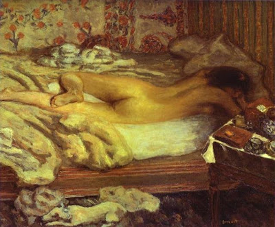
Bonnard interacted with many of the Impressionists of his day. Siesta (above, from 1899), one of many paintings in which Bonnard used his young wife as a model, shows the influence of Edgar Degas and his treatment of the female form. Bonnard helped found the group Les Nabis in the 1890s. Following the philosophy of Paul Gauguin if not Gauguin’s specific technique, Bonnard and others looked to infuse the subjects of Impressionism, such as the female nude, with a sense of spirituality and awe. In works such as Siesta and Indolence (also 1899), Bonnard transforms the nude female body into a religious artifact, literally pulsating with energetic color. The same primal force Gauguin found in the woman of the islands Bonnard found in the women of France, specifically his beloved wife.


In 1926, Bonnard moved to the French Riviera, where he remained for the rest of his life. Works such as Landing Stage (above, from 1938-1939) show Bonnard’s love for the blue skies and water of the Riviera—the blue that Henri Matisse claimed he had been searching for all his life. Although Bonnard opened up his palette to a whole new world of color, he never embraced Fauvism or any other new art movement of the first half of the twentieth century. Bonnard carried on in his personalized Post-Impressionist fashion until his death in 1947, five years after the passing of his beloved wife. It’s hard to think of Impressionism stretching past the horror of Nazism and World War II, but Bonnard outlived even those movements in history. Like a fine bottle of champagne, Bonnard kept bubbling along and never stopped being the life of the party.

Friday, September 19, 2008

Child’s Play


One of the great joys of parenthood is reading to your child. All those great illustrated books that you tucked back in the back of your mind as adulthood crowded the front suddenly emerge from your subconscious. So many contemporary illustrators owe a huge debt to their Victorian forebears, who essentially created the idea of illustrated children’s tales and, therefore, childhood itself. Arthur Rackham stands among the first-rank illustrators of that initial wave of creativity. Born September 18, 1867, Rackham first gained the public’s attention with his illustrations to Peter Pan in Kensington Gardens (originally part of The Little White Bird) by J.M. Barrie. (Rackham’s frontispiece appears above, from 1906.) Seven-day-old Peter Pan watches fairies flee from him as he stands among the garden’s trees, which twist with almost sinister intent. Director Guillermo Del Toro credits Rackham as one of the visual influences for Pan's Labyrinth, in which nature itself seems to conspire against the young child’s happiness in her fulfillment of her quest. Rackham’s images appear as fresh as they did over a century ago, with none of that Victorian mustiness.


Rackham achieves that perfect balance of realism with magic that makes the magic seem actually believable. In one illustration for Flora Annie Steel’s 1918 edition of English Fairy Tales, Rackham shows “The giant Galligantua and the wicked old magician transform the duke's daughter into a white hind” (above, from 1918). The fidelity of the white hind makes the grotesque giant and wizened wizard almost believable. That balance is the key to all successful children’s illustration, at least for me, and Alex. One of Alex’s favorite illustrators, Sylvia Long, can put rabbits in pajamas or eyeglasses on bears and make even adults momentarily suspend their disbelief thanks to her superior draftsmanship. Rackham worked at a time when the line between book illustration and fine art wasn’t as clearly drawn as today and even exhibited some of his work in the Louvre in 1914. Only in the last twenty years, after a long dismissal of such art as kid’s stuff, have collectors and museums re-recognized the artistry of creators such as Rackham.


Rackham turned his eye to other subjects that were certainly not child’s play, but no less imaginative. In 1910, Rackham painted a series of illustrations for Richard Wagner's "The Ring" (one example above). The sense of flowing movement from upper left to the dark right corner is effortless. We feel as if we’re falling with the figures Rackham draws. The sharp diagonal line reveals Rackham’s interest in Japonisme, especially ukiyo-e, Japanese wood-block prints, which opened the eyes of Western artists to new compositional possibilities. Rackham also illustrated Shakespeare’s A Midsummer Night's Dream and tales by Edgar Allan Poe, among other “adult” works. If you want to lump Rackham in with any group of artists or movement, Art Nouveau would probably suit him best, but there’s an individuality to Rackham’s art that keeps it fresh and virtually as timeless as the wonder of childhood itself.

Friday, September 12, 2008

Stormy Weather


When the skies above Amsterdam turn slate grey and rain begins to fall, the locals lament, "Echt Breitnerweer" (in English, “Typical Breitnerweather”) in memory of the great Dutch Impressionist George Hendrik Breitner. Born September 12, 1857, Breitner loved to paint the city in inclement weather, as in The Singel Bridge near the Paleisstraat in Amsterdam (above, from 1897). Breitner earned and enjoyed the nickname “the People’s Painter” in his native Netherlands, feeling a kinship with the everyday people of the streets. In 1882, Breitner met and befriended fellow artist Vincent van Gogh. Breitner and Van Gogh often went to the poorer sections of The Hague in search of subjects to sketch. Although they shared a common interest in the poor, Breitner and Van Gogh diverged when it came to technique, especially color. While Van Gogh went off to France and imbibed the rainbow of colors he found there, Breitner never escaped the dark, depressing color spectrum of his native Amsterdam.


Like Van Gogh and many artists of the period, Breitner grew fascinated with the art of the East and Japonisme. Brietner found great beauty in the intricate designs of the Japanese kimono and painted a series of portraits of young women in kimonos, including Girl in a White Kimono (above, from 1894). Strangely, Breitner hides much of the beauty of the garment in shadow. He almost entirely obscures the beauty of the young woman not only in the bulky fabric but also by posing her in an awkward manner. There’s nothing sexy about Breitner’s portraits of women in kimonos. Any kind of exotic allure disappears in his hands, yet there’s still something fascinating about them. It’s as if he struggled with the opposing impulses of embracing and rejecting the “other” and wanted to paint that in these portraits. After such close contact with Van Gogh, whose unfettered adoption of foreign influences was almost as strong as his erratic personal nature, Breitner may have connected the two and feared for his own mental safety if he strayed too far from home artistically.


Despite these divergences with Van Gogh, there are may similarities, the strongest of which is an eye for the beautiful simplicity of the life of the Dutch poor. In Promenade Deck with Three Ladies (above, from 1897), Breitner freely depicts three women on a ship’s deck to the point that they lose almost all individuality. They hold onto their hats in the violent winds, obscuring their faces. The whiteness of their hats and skirts pops against the darker tones of the rest of the painting. That strong contrast of light and dark drew Breitner’s eye and inspired this almost abstract painting of people on a ship. By this time, Breitner had become a proficient photographer, capturing much of the look of the dank city streets on film that a representative approach to painting may have seemed redundant. In works such as Promenade Deck with Three Ladies, Breitner tries to get at the soul of the poor beneath the rustic exterior. When Breitner looks with his heart into the heart of these people, we truly find “typical” Breitner.

Friday, September 5, 2008

In Black and White


When Vincent Van Gogh looked for sources of inspiration, he turned East and joined in the Japonisme craze that captured the imagination of many European artists in the late nineteenth century. In 1921, Japanese artist Shiko Munakata reversed the line of influence when he saw Van Gogh’s art and tried to incorporate it into his woodcuts. Despite emulating Van Gogh’s frenetic draftsmanship, Munakata always maintained a sense of the Zen Buddhism he so deeply believed in, primarily through depictions of Buddha as in Gautama and Bodhisattvas (above, from 1958). Buddha, whose family name was Gautama, sits with the Bodhisattvas or spiritual beings who linger on earth to help others reach enlightenment. Born September 5, 1903, Munakata enlightened viewers with his revitalization of the ancient Japanese woodcut through infusions of Western art ideas. “I make black and white prints because I want to go back to the beginning,” Munakata once said, humbly downplaying the sophistication behind his simple, black and white designs.


Munakata brought a unique vision to the woodcut. In works such as Fugen (Samantabhadra Riding on an Elephant) (above, from 1950), Munakata colored the image on the front of the thin translucent paper by painting watercolor to the back of the sheet, which bled through to the front. It’s interesting to see how Munakata’s adaptation of Van Gogh in his woodcuts diverges from the German Expressionists’ adaptation of Van Gogh’s art. Whereas German artists such as Ernst Ludwig Kirchner, Karl Schmidt-Rottluff, and Emil Nolde emphasized Van Gogh’s angst, Munakata instead, perhaps thanks to his Zen Buddhism, saw Van Gogh’s more joyous embrace of nature’s harmony. The vibrancy of a Van Gogh landscape spoke to Munakata, who adapted that energy to the Buddhist belief in the unity of all being as embodied in mythic figures such as Samantabhadra riding an elephant. Munakata carved with great speed, working on the woodblock with no preparatory drawings and allowing the spirit of the work to guide his hand. Never losing faith in the process itself, Munakata accepted accidents and errors graciously as the price for “riding the elephant” he called art. For him, each painting stood as just another manifestation of the greater scheme of nature and beyond human judgment.


Munakata carved series of woodcuts based not only on disciples of Buddha, but also created a calendar of the months featuring different flowers and natural features. The print for February showing an Orchid (Nigatsu—Ranjo no saku) (above, from 1956) shows just how inventive Munakata could be with a basic black framework into which he introduces passionate color. Van Gogh’s flower studies formed the earliest influence on Munakata, and still influenced him in this image more than 30 years later. The accessibility of Munakata’s prints made him a popular figure in Japan and helped him rise to the status of a national treasure. Cursed with poor eyesight, Munakata often carved his woodcuts with his face inches away from the wood, his Mr. Magoo glasses nearly touching the surface. Like Van Gogh, Munakata’s simple ways often earned him the label of primitive or worse, but also allowed him to strip his art to its barest essence and rebuild it in his own unique vision.

Wednesday, August 20, 2008

Tales of the City


While reading James H. Rubin’s Impressionism and the Modern Landscape: Productivity, Technology, and Urbanization from Manet to Van Gogh, I came away with a much higher opinion of the art of Gustave Caillebotte. Born August 19, 1848, Caillebotte often suffers from an critical inferiority complex thanks to his dual role as patron of the Impressionists as well as being one of them. Rubin’s essential argument (which I’ll discuss more in depth when I post my review) centers around how the Impressionists embraced the trappings of modern life and progress rather than rejected them in a turn back to nature, which is the common narrative hung around the necks of the movement. No artist of the time embraced the post-Haussmann look of Paris as enthusiastically and strikingly as Caillebotte in such images as Paris Street, Rainy Day (above, from 1877). With almost photographic realism, Caillebotte sends the viewer’s eyes shooting down the long thoroughfares of the modernized Paris while simultaneously depicting the modern look of cosmopolitans as they walk in the rain. As Rubin points out, French Impressionism means leisure and nature to most people, but to many Impressionists it meant the world around them, especially the fast-paced, highly modern city of Paris.


With a nod towards Japonisme, Caillebotte used striking perspective and cropping to generate the sense of speed and movement in works such as Le Pont de l'Europe (above, from 1876). The powerful line of the bridge disappearing into space naturally pulls our attention into the distance. Against that rapid flow, the pedestrians walk towards us. The man addressing the young woman may actually be soliciting her, reflecting the sad reality of prostitution that plagued Paris and most modern cities at the time as women’s rights and options lagged behind the times. The man standing at the rail, covering his face as he looks below, may be contemplating suicide, reflecting the sad reality of fast financial success and ruin as unstable markets led many unstable souls to a bitter end. Adding to this multilayered snapshot of Parisian life, Caillebotte makes extraordinary use of the steel architecture of the bridge itself, finding a beauty in the intricacies of engineering that made such new bridges (and, thus, improved water travel and commerce) possible.


Kirk Varnedoe often praised Caillebotte for bringing a whole new perspective to the Impressionist oeuvre that other, more well-known artists did not. Works such as Boulevard Seen From Above (above, from 1880) show Caillebotte’s love of photography and its ability to capture familiar scenes from unique perspectives. During his lifetime, Caillebotte seemed more of a dilettante than a serious artist, due probably to the great family wealth that allowed him to purchase many of the great works of his friends and fellow artists, such as Degas, Renoir, and others. Little did I know when touring the Barnes Foundation that I was seeing most of Caillebotte’s personal collection, purchased by Dr. Albert C. Barnes after the artist’s death. Perhaps with a greater appreciation of the variety and diversity of the Impressionist movement through works such as Rubin’s, Caillebotte will finally find room to have a name for himself.