Monday, June 30, 2008

The Contest


No, not THAT "Contest."

Coming to Art Blog By Bob this Thursday, July 3rd, will be the first Art Contest By Bob in which a copy of Ségolène Le Men’s Courbet (a $135 book) published by Abbeville Press will be given to one lucky reader. Tune in this Thursday for details on how to enter as well as for a review of the book itself.

Making Things Complicated


They say that war does things to a man. World War I certainly did a number on the psyche of Sir Stanley Spencer, one of England’s greatest twentieth-century painters. Born June 30, 1891, Spencer served with honor in the First World War and created stirringly beautiful paintings of wounded men on stretchers that conveyed the same grandeur Spencer felt during the experience. Upon returning home to England, Spencer gained fame and success as a painter of war pictures memorializing the men who did not return. In 1925, Spencer married his first wife, Hilda Carline, and they had two daughters. In 1932, however, Spencer met Patricia Preece, a bisexual artist. After carrying on an affair with Preece for several years, Spencer finally divorced Hilda in 1937 and married Preece four days later. Rather than go on a honeymoon with Spencer, Preece instead went with artist Dorothy Hepworth, her other lover. Spencer’s Self-Portait with Patricia Preece (above, from 1936) shows the strange relationship between Spencer and Preece, with the bespectacled Spencer acting more like an audience than a participant in the relationship. “The law does not allow me to have two wives,” Spencer wrote in a 1936 letter he never sent to his wife. “Yet I must and will have two. My development (as an artist) depends on my having both you and Patricia.” Somehow Spencer’s art could only move forward if his personal life became bizarrely complicated enough to reflect his inner demons.


Despite the divorce, Spencer continued to maintain ties with his first wife and their daughters. In The Nursery (above, from 1936), Spencer turns the domestic scene into a surreal world that must have seemed even more unsettling to his family at the time. While Preece fled with Hepworth, Spencer tempted his first wife back to him and seduced her. In a diary he wrote, “For the only time in my life so far, I had the joy of doing what for years I had wanted to do, namely to make love to two women at once.” Fulfilling that fantasy, Spencer left Hilda again to pursue Preece. Preece rejected Spencer, reportedly never consummating their marriage and leaving Spencer utterly alone. When World War II rolled around, Spencer again painted war-related images, eventually earning a knighthood for his service to his country. As complicated as his personal life became, Spencer amazingly managed to segregate his two artistic lives, presenting a patriotic face to the world while the disturbed mind behind it continued to struggle with intimacy issues.


In 1958, Spencer learned that he had cancer. In his final Self-Portrait (above, from 1959), Spencer unflinchingly looks out at the world in extreme close-up. Knowing death was close, Spencer took one last long, hard look in the bedroom mirror and depicted himself with startling honesty. Completely unidealized, Spencer’s final Self-Portrait with its glasses slightly askew and uneven eyes conveys a type of madness that Spencer himself must have diagnosed in himself. Spencer’s brutal honesty and willingness to paint his sexuality at its most troubled set a precedent that later British artists such as Francis Bacon and Lucien Freud followed. In a post- Sigmund Freud world, Spencer’s paintings may have acted as an attempt at a “talking cure,” but one that never cured him.

Knight Rider


As much as being knighted is an honor, being knighted twice has to be a surreal experience. Born June 28, 1577, Peter Paul Rubens knelt before both Spain’s Philip IV and England’s Charles I and rose a knight of each of those realms in appreciation for his diplomatic service. Rubens helped bring not only peace to Europe but became a self-appointed ambassador of art, bringing not only his own artwork across borders but also the works of others. Not least of all, Rubens enlisted in the battle for Europe’s collective soul, fighting on the side of the Counter-Reformation with such works as The Raising of the Cross (above, from 1610-1611), a Baroque bombshell that fused the heavenly Renaissance reach of Michelangelo with the grounded earthiness of Flemish painting. Rubens often seems more than one man, present everywhere, fighting for every cause, and influenced by and influencing everyone.


Rubens’ trip to Italy in 1600 shaped him irreversibly into the artist we know today. From the older works of Michelangelo, Raphael, and da Vinci to more recent works by Tintoretto, Veronese, and Caravaggio, Rubens saw and understood them all. For the rest of his life, Rubens affected an adopted Italian-ness, often writing to others in Italian and even signing his name Pietro Paulo. In The Fall of the Rebel Angels (above, from 1618-1620), Rubens seems to rewrite Michelangelo’s The Last Judgment by presenting the “first judgment” in which God banished Lucifer and the rebellious angels from Heaven. The writhing bodies seem to fall in thick chains of flesh into the fiery depths. The powerful diagonal Rubens uses almost acts like a slide upon which the fallen angels descend into perdition. Rubens’ painting serves notice to all those mortals who would follow Martin Luther of the fate once bestowed on heavenly beings that may also await them.


For all his contemporary influence in so many fields of endeavor, what we think when we hear the name Rubens today is the curvy, sensuous, classically Rubenesque female nude, as displayed and judged in The Judgment of Paris (above, from 1639). Rubens appreciated the late work of Titian when few others did. As wonderfully explained in Late Titian and the Sensuality of Painting (reviewed earlier here), Titian’s late works not only took on erotic subjects but also depicted them with a physicality rarely seen before and, therefore, misunderstood by Titian’s contemporaries. Rubens, however, saw the genius of Titian’s nymphs and danae and similarly freed his style (and mind) to the possibility of nudes expressive by brushwork rather than pose or composition. In The Judgment of Paris, Rubens shows exemplary judgment in stripping away all the influences he had amassed in his travels and getting down, like Titian, to the simple act of placing paint on canvas as an extension of the heart and soul. After so many years of battles and causes, Rubens retired to the confines of his own expressiveness.

Friday, June 27, 2008

Tour Guide


In the eighteenth century, anybody who was anyone took the Grand Tour, traipsing about Europe to see all the “glory that was Greece and the grandeur that was Rome.” The best way of capturing those memories pre-photography was to commission a portrait, and the best man for the job was Pompeo Batoni. A Knight in Rome: Charles Cecil Roberts (above, from 1778) shows one of Batoni’s satisfied customers in full regalia against a backdrop of classical props to ensure that everyone who saw it knew that the subject had made the trip and was now “cultured.” Born June 25, 1708, Batoni recently received a wonderful 300th birthday present from the National Gallery in London, whose exhibition may resurrect his once omnipresent reputation. While traveling in Rome in 1760, Benjamin West complained that Italian artists spoke of and imitated no one but Batoni. Starting out as a Rococo painter, Batoni soon embraced the lessons of classical art, helping usher in the age of Neoclassicism that fed the taste for the past whetted by the Grand Tour craze.


Batoni’s portraits won him his largest acclaim, but he began building his reputation with religious works such as The Ecstasy of St. Catherine of Siena (above, from 1743). By this time, Batoni already rejected the showiness of Rococo for a more controlled style aligned with the ancient Greek and Roman works recently rediscovered and studied by the first art historians, especially Johann Winckelmann, who became a friend of Batoni. Compare this ecstasy with the greatest ecstasy of the Baroque age—Giovanni Lorenzo Bernini’s Ecstasy of Saint Theresa. Side by side, Batoni’s work appears, well, less ecstatic and more controlled. The drama, energy, and tension remain, but Batoni turns the heat down to a low simmer where Bernini burns red hot. Swept up in the rationalizing wave of the Enlightenment, Batoni went with the flow and prioritized head over heart.


The same composure that Nicolas Poussin espoused in the seventeenth century, Batoni preached in the eighteenth. In turn, Batoni passed on the Neoclassical torch to Jacques-Louis David, to whom Batoni reportedly left his palette and brushes when he died. In works such as The Death of Meleager (above, from 1740-1743), Batoni made cool amazingly compelling. Reaching back into the mythology of Greece, Batoni shows Atalanta mourning for the dead Meleager. Batoni bleeds all the passion away, leaving the pathos of the two figures, accompanied by the strikingly attentive dog at the bottom right that steals the scene. Yet, this bloodless bloodletting remains compelling thanks to how wonderfully Batoni renders the different fabrics and actually creates a kind of movement in all the levels of darks and lights, making the body of Atalanta almost glow in contrast to the dimming light of Meleager. The pendulum of all art swings from hot to cool, from Dionysian to Apollonian, but Batoni made that pendulum swing to the cool, classical extreme as compellingly as any artist ever has.

Yippie Kay Ay


I’ve never been much for Westerns. My father loved them, so I’d sit through tumbleweed-infested flicks and wonder what all the fuss was. Certain films, like The Searchers, certainly caught my attention, but for the most part I found the fantasy of the American West just too fantastic. The art of Frank Tenney Johnson helps ease some of my inborn aversion. Born June 26, 1874, Johnson lived in the Midwest for most of his life before heading to New York City to learn art at the Art Students League of New York under American Impressionist John Henry Twachtman. Johnson headed west soon after, taking Twachtman’s style with him and eventually perfecting the play of moonlight on figures in motion, most often cowboys riding their mounts, as in Texas Night Riders (above, from 1929). In contrast to Frederic Remington, who mythologized the West like no other (my favorite “bad” Remington shows a man loading a rifle on a galloping horse by spitting the bullet down the barrel), Johnson shows remarkable restraint, presenting an idealized vision of cowboys, of course, but one that remains rooted in reality.


What separates Johnson from Remington may be the fact that Johnson actually spent time on ranches, observing and talking with the men who worked with the animals and faced the obstacles of nature. Remington wove his images out of brief opportunities of observation, taking just enough visual memory back for him to interject his own imaginative flights of fancy. In Ever Westward (above, from 1910), Johnson paints a wagon train of pioneers crossing the continent to the promise of a new life. The painting contains a high level of sentimentality, down to the grizzled old hand leading the pack with his faithful dog alongside, but that dreaminess softens rather than obscures a factual core. Remington would have a horde of “Injuns” pour over the nearest hill and the pioneers desperately circling the wagons, whereas Johnson shows the mostly quiet course of everyday life. Johnson reportedly painted often with his fingers to achieve his effects, just another way that his paintings are “hands on” more than those of other Western artists.


Johnson illustrated many of the Western novels of Zane Grey, adding evocative visuals to Grey’s evocative prose. Grey’s dramatic inventions play right into the stereotypes of the Old West, but his sense of the beauty of the landscape and the cowboy life match those of Johnson well. Johnson’s Nocturne (above, from 1915) seems like something Whistler would have painted had he found himself at home on the range. The range of blues makes this a symphony of tones. The shadow obscuring the rider’s face lends the work a sense of mystery that pulls you into the story being told. The white line running down the horse’s face anchors the entire work. Regardless of subject matter, Johnson knew the art of composition and tonality inside out. Because of his subject matter, however, and his deft handling of it, Johnson belongs with the ranks of those truly American artists who painted American life as it was truly lived.

Thursday, June 26, 2008

Surrender at the Courthouse


As far as historic surrenders go, it wasn’t exactly Lee at Appomatox, but it did happen at a courthouse and it did signal the end of a misguided cause. The title of the story in the Philadelphia Inquirer said it all: Fight to Halt Move of Barnes Foundation Ends. In a victory for art lovers everywhere, works such as the Barnes’ version of Cezanne’s La Montagne Saint Victoire (above, from 1895) will now be enjoyed by more than the select few who could make it through all the restrictions imposed on visitors to the original Barnes Foundation site. I’m sure members of the Friends of the Barnes Foundation will disagree with me and find me overly gleeful at the end of six years of litigation, but it was a losing battle from the start. Even if they had won, so many others would have lost.


Last week, Evelyn Yaari of the Friends of the Barnes Foundation entered the Norristown courthouse office of Montgomery County, Pennsylvania looking to continue the legal battles with a fresh check and a new stack of documents. After checking with the group’s lawyer, however, Yaari raised the white flag. "I had to go to the clerk and say, 'I'm very sorry I asked you to do that, but actually, I'm not going to file the appeal,' " Yaari said. "It was a sad moment." For the City of Philadelphia, dreaming of a “Museum Mile” stretching from the PMA to the PAFA with the Rodin Museum and the new Barnes between, it was a moment of joy on the scale of the Barnes’ The Joy of Life (above, from 1905) by Matisse. The new Barnes will add that final piece to allow Philadelphia’s “mile” to compete with that of New York, hopefully bringing increased tourism and tourist money to our sagging economy.


For most Philadelphians, the Barnes case served as the artistic parallel to the Mumia Abu-Jamal case—the further you lived from Philadelphia, the more you thought the Barnes should stay (and the more you were convinced of Mumia’s “innocence”). The more you knew, the more you saw the sense behind the Barnes’ move to Philadelphia. In the comments to the Inquirer story, a Barnes employee using the screen name “msmame” says the following:

Posted by msmame 07:57 AM, 06/18/2008
The entire Foundation is not moving, only certain works. The school and many pieces will remain at the mansion. I can tell you, as someone who has worked there, the pieces are literally stacked on top of each other and the place is busting at the seams. The neighbors were selfish to think they could keep it to themselves while strangling its ability to make money—even even enough to remain viable. As for those who are opposed to the will being changed, the ONLY alternative would have been to start selling off pieces which was also against the terms of the will. The trustees chose the lesser of two evils. None of this would have ever been a problem if the neighbors hadn't used the same county government & courts that tried to keep the collection to destroy it. Take a walk down Latches Lane, see the signs that say "The Barnes belongs in Merion" and KNOW these are the very same hypocrites who sued to limit the number and days visitors can go to the museum.


Dr. Barnes helped design the unique displays of the artwork (an example shown above), which are artistic in vision but not necessarily the best way to appreciate the works. Many hang too high or are poorly lit. (Stories of damage during mishandling are too horrific to repeat here.) The absence of identifying wall plaques leaves most visitors totally in the dark, offsetting Barnes intention to free the viewers mind from the constraints of labels and experience the work afresh. These works are now classics, so any shock of the new wore off long ago. I understand that the new site will try to reproduce Barnes’ displays to some degree, which should soothe some of the Barnes purists.

Fortunately, the City of Philadelphia began planning for the new site long before this final surrender, knowing that they’d win eventually. Six years of legal fees later, however, you wonder how that money could have been better spent and how long this wasteful battle will delay the new building’s opening. Considering how money-driven the American legal system is today, it’s amazing that the Main Line money lost, proving just how lost their cause was from the start. The Friends may rise again, of course, but they’d just be whistling “Dixie.”

Wednesday, June 25, 2008

Lifting Spirits


"Paint what you feel. Paint what you see. Paint what is real to you." Robert Henri’s words, as recorded by former student Margery Ryerson and published in The Art Spirit, continue to inspire art students and professional artists even today. When I interviewed Karl J. Kuerner, he quoted Henri more than his famous neighbor, Andrew Wyeth. Born June 24, 1865, Henri learned the classic realist technique at the PAFA and then Impressionism in Paris. By 1895, however, he disowned Impressionism in search of a style that spoke to him, arriving finally at a brand of romantic realism that became disparagingly and inaccurately known as the Ashcan School. Just one look at Henri’s Salome (above, from 1909), which shows a contemporary dancer in costume for the stage role, and you can see that Henri’s work was anything but down and dirty. Although some of his protégés—William Glackens, George Luks, and John Sloan—got gritty at times, Henri’s work exemplifies the elegance of a refined man with a common touch, who could find beauty in both Old Masters and young children playing in the street.


At the PAFA, Henri studied under Thomas Anshutz, the former assistant and (as we now know today) betrayer of Thomas Eakins. That connection gives Henri’s admiration for Eakins a whole new dimension. Eakins’ “iron will and his will to paint and to carry out his life as he thought it should go,” Henri wrote, “cost him heavily, but in his works we have the precious result of his independence, his generous heart and his big mind.” “’Integrity’ is the word which seems best to fit him,” Henri says of Eakins, adding that he considered Eakins “the greatest portrait painter America has produced.” In Henri’s portraits we see a similar integrity, yet with a freer style vastly different than that of Eakins. In The Irish Boy in Blue Denim (aka, Anthony Lavelle) (above, from 1927), Henri captures the innocence and freshness of the boy’s face, but in a style that not only harks back to his Impressionist days, but also seems influenced by all the other European modernist movements swirling around him. Henri always remained true to himself, but never failed to keep his eyes and his mind open to new experiences.


Henri the never-ending student made for one of the greatest art teachers in American art history. William Merritt Chase and Henri waged an unofficial “war” for the minds and hearts of American art students at the beginning of the twentieth century. It’s hard to declare a winner, but the track record of Henri’s greatest students—Glackens, Luks, Sloan, George Bellows, Edward Hopper, Rockwell Kent, and Stuart Davis, among others—speaks for itself. Henri’s painting The Art Student (above, from 1906), a portrait of Josephine Nivison, the future Mrs. Edward Hopper, shows the affection Henri had for all his students, to whom he taught the ways of life as much as the ways of art. "Art cannot be separated from life,” Henri told them. “It is the expression of the greatest need of which life is capable, and we value art not because of the skilled product, but because of its revelation of a life's experience." Such sentiments ensure that Henri’s spirit will continue to live on in the hearts of artists and art lovers.

Mistaken Identity


When Ferdinand Bol died in 1680, he most likely believed that he’d been a much greater success than his teacher, whose erratic behavior, eccentric painting style, and poor relationships with the powerful resulted in a life of poverty, despite his amazing talent. Bol’s teacher was Rembrandt, whose influence can be seen in Bol’s Portrait of Elisabeth Bas (above, from 1640). Baptized June 24, 1616, Bol painted the rich and powerful, like Rembrandt. And, like Rembrandt, he painted them in all their finery and frills, even if they were outdated by this time. Unlike Rembrandt, however, Bol treaded lightly in his depictions, making sure to build and burn bridges that might further his career later. Because of their very similar styles and subject matter, many of Bol’s works were mistaken for those by Rembrandt in the nineteenth century, including the Portrait of Elisabeth Bas. In many ways, Bol presents what Rembrandt’s life could have been if he had lived it a little differently. In those differences, however, lay the seeds of greatness versus near-greatness.


In 1652, Bol joined the ranks of the burghers in Amsterdam. A year later, he married the daughter of a man who held powerful guild positions in the city, thus opening the door to more and more lucrative commissions. Bol never frowned at charges of nepotism, playing the game that Rembrandt refused to. Perhaps the sight of Rembrandt suffering from his choices in the name of integrity steeled Bol in selling himself out as much as possible. Bol’s Venus and Adonis (above, from 1657), although beautifully rendered, played to the tastes of the wealthy merchant class who looked to adorn their homes with art. Bol makes the scandalous nude acceptable with the mythological label, allowing the owner to feel a vicarious thrill without the whispers of neighbors. Two turtle doves placed in the foreground drive home the obvious fact that the pair are lovers with all the subtlety of a sledgehammer. Boll played to the crowd, regardless of how low he had to sink.


Bol grew successful enough to retire from painting and enjoy his last years in luxury. When Bol married well for a second time, he presented a grand Self-Portrait (above, from 1667) to his bride. The curly wig, elegant robe, and velvet cloak attest to his success—all set within a hand-carved, gilded frame Bol ordered himself. The sleeping Cupid that Bol leans on symbolizes his dormant passion at 53 years of age, an interesting fact to point out to your new wife, even if he did mean it as a sign of fidelity. Contrast this self-portrait in your mind with the late self-portraits of Rembrandt, who seems heavier and wearier with each depiction. There’s no denying the quality of Bol, whose rendering of fabrics and highlights in his self-portrait show that he learned his lessons well from Rembrandt. There are many good reasons why the two artists were so long confused. However, it seems to me that there’s something missing from Bol’s works—an unexplainable spark that Rembrandt couldn’t teach. Suffering for your art shouldn’t be a requirement for greatness, but the easy road that Bol chose may have made all the difference between him and his teacher, making telling them apart easier today.

Tuesday, June 24, 2008

Final Gestures

Titian, Nymph and Shepherd, c. 1570-1575. Vienna, Kunsthistorisches Museum di Vienna. 149.7 x 187 cm.

Listen to the final works of Beethoven–the last string quartets or the Ninth Symphony—and you hear a wholly different composer. Whether that difference came from Beethoven’s encroaching deafness, a philosophical epiphany born of a lifetime of experience, or both will always be a subject for debate. In Late Titian and the Sensuality of Painting, the last 25 years of Titian’s life undergo a similar debate. Did Titian’s new, freer brushwork originate from his failing vision and dexterity, the insights of age, both, or neither? Sylvia Ferino-Pagden edits this collection of essays accompanying a selection of works on display earlier in 2008 at the Kunsthistorisches Museum in Vienna and Gallerie dell’Accademia in Venice. Through the use of x-rays and infrared reflectography as well as cross-sections of the paintings, works such as Nymph and Shepherd (above) reveal not only the pentimenti (overpainted drawings) of such works but also the thought processes of Titian in his final years. In an essay examining Nymph and Shepherd as a classic case study of Titian’s final period, Elke Oberthaler writes, “As with no other painter, painting practice and technique in Titian’s late work have themselves been thematised and charged with meaning.” Late Titian and the Sensuality of Painting recharges Titian’s works with meaning for a modern audience more receptive to such technique than Titian’s own contemporaries.

Titan, Allegory of Prudence, c. 1565-1575. London, National Gallery. 76.2 x 69.6 cm.

When a diplomat asked Titian why his later works differed so greatly from earlier ones, Titian answered that he gave up trying to match Michelangelo, Raphael, and others in refinement and beauty, aiming to make his mark with a new roughness of handling. “Thus, Titian’s visible brushwork is also his artistic signature,” Ferino-Pagden writes in her introductory essay. Titian’s Allegory of Prudence (above) visually depicts the artist’s concern with legacy. On the left, Titian paints himself as an old man, literally fading into the darkness. Titian’s son, Orazion, heir to the family painting workshop, dominates the center in the prime of his life, as Titian’s young nephew Marco appears on the right, full of youthful enthusiasm and indecision. The “prudence” allegorized here is more wisdom than caution, as Titian wisely recognized that his day had passed and his son’s sun was rising. Titian added the wolf, lion, and dog appearing below the portraits at a late stage, placing another layer of personalized mythology onto the image. Sadly, Titian and Orazion both died of plague in 1576, leaving the family workshop prey to looters and definitively ending the “school” of Titian.


Titian, Jacopo Strada, c. 1566. Vienna, Kunsthistorisches Museum di Vienna. 125 x 90 cm.

Titian’s late style brought him more grief than joy. Giorgio Vasari, who included Titian in his Lives after meeting the artist in 1566, believed that these late works damaged his reputation, clouding over earlier success. Augusto Gentili writes that Titian’s Venetian contemporaries saw Titian’s rough style as “a gratuitous and presumptuous offense, not only to the figurative, but also the civic tradition of Venice.” Venice’s favored son metaphorically betrayed his home and its artistic tradition in going his own way. By the 1560s, Titian lost most church commissions to the rising generation of artists that included Tintoretto and Veronese. Fortunately, private clients and old admirers still provided Titian with work, mostly in the line of portraiture, such as the portrait of the art dealer Jacopo Strada (above). Thanks to x-ray and infrared cameras, we can see beneath the surface of this portrait multiple changes, including additional figures. Titian originally made Strada’s expression “slightly less proud,” writes Wencke Deiters and Natalia Gustavson, and altered the composition to be more vivid arrangement in which “diagonals dominate the structure, lending the scene an atmosphere of both instability and dynamism.” As time slowed Titian’s body down, his artistic vision sped up, injecting more and more movement and energy into his works.


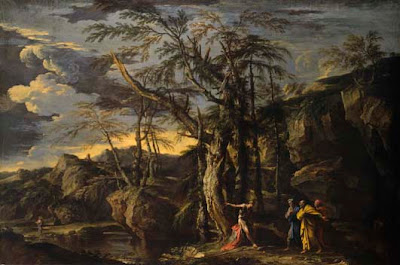
Titian, Saint Jerome in the Desert, c. 1570-1575. Madrid, Museo Thyssen-Bornemisza. 135 x 96 cm.

Not only Titian’s style but also his religious sensibilities precluded him from much church work in his late period. In “Titian’s Prudent Dissent: Painting Religion in the Disciplinary Years,” Augusto Gentili sees Titian as “openly hostile to the bureaucratic rules and theological subtleties both of the ‘Papists’ and the ‘Lutherans.’” Titian, thus, “tends toward an immediately understandable, highly individualist religion that is inevitably disturbing because subject to increasingly impelling forms of control.” To resist all control, Titian, like many of his contemporaries, gets back to basics in a “highly sentimental, Christ-centered religion.” In Saint Jerome in the Desert, Titian lends the saint his own face, which is turned in adoration to a crucifix. In the barren desert, Jerome/Titian “has abandoned everything—but not Christ, not wisdom,” Gentili writes. In such images, the rough brushwork mirrors the rough simplicity of Titian’s faith, which has been tested by fate yet remains strong. Titian intended for his tomb a Pieta in which he again appears as Saint Jerome, humbly touching the body of Christ, but it remained unfinished at his death.


Titian, The Flaying of Marsyas, c. 1570-1575. Kromeriz, Archdiocese Olomouc, Archiepiscopal Palace, Picture Gallery. 212 x 207 cm.

Titian’s faith in the power of art, however, seems to waiver at the end. In The Flaying of Marsyas, Titian combines two tales from Ovid’s Metamorphoses and casts himself as King Midas witnessing the torture of Marsyas. Titian chooses to show Midas not using his golden touch but, instead, watching violence impotently. “By painting himself as Midas,” Fernando Checa writes, “Titian is not only practicing self-criticism of his position as a court painter who loves riches,” but also “expressing profound criticism of his own nature as an artist.” As Sylvia Ferino-Pagden later puts it, “The artist may here have reflected on the power and powerlessness of art as an instrument in changing the world.” Such pessimism comes before even the death of his son and the apparent conclusion of his reputation. Fortunately, artists such as Rubens, Rembrandt, Velazquez, Delacroix, and even moderns such as the German Expressionists and Oskar Kokoschka, came to see the beauty and power of Titian’s late works, rediscovering them as the final exclamation point on a long career rather than the sad ellipsis Vasari believed them to be.

Late Titian and the Sensuality of Painting brings these amazing works to light with large, beautiful reproductions. A sense of Titian’s sensuality comes across not just in the poesia or eroticized mythological painting such as Nymph and Shepherd (top of post) but also in the lush, free gestures that give a sense of individuality that seems strikingly modern. Modern technology now allows us to look beneath the painted surfaces and glimpse into the mind of the artist himself, permitting us to know Titian’s thinking better perhaps than even his contemporaries did. The essays in the catalogue, ably translated from the original German and Italian, lose nothing in translation in terms of explaining the genius and continued relevance of Titian.


[Many thanks to Marsilio Editori for providing me with a review copy of Late Titian and the Sensuality of Painting and to Civita for the images above.]

Monday, June 23, 2008

Curious George


Watching the ultrabland, overgroomed, tightly buttoned hairpieces that pass for television news personalities eulogize George Carlin, who passed away last night, as if he were a seminal influence on their lives was an absurd moment worthy of a George Carlin comic diatribe. Even posthumously, Carlin's material continues to flow around us. I can honestly say the Carlin was and remains an influence on me, kind of that strange, funny uncle who would pull you aside and tell you what the real score was. Carlin's "Seven Words You Can Never Say on Television" (which all the television tributes STILL aren't allowed to say, as they kept pointing out) made me see language in a whole new way, teaching lessons about power and authority that made me laugh and think at the same time. (Carlin's mug shot from his arrest over the "Seven Words" controversy appears above.) Every teenager should have the joy of listening to a Carlin album when their parents think they're doing something else and discovering the strange uncle they never knew they had. Carlin's curiosity shall live on as long as someone can point a finger at absurdity in its most cruel and bullying forms and laugh, rather than cry.

Starting Fires


One of the best and worse things someone can call you is a “troublemaker.” It all depends on who’s doing the name-calling. During his lifetime, enough of the wrong people called Rockwell Kent a troublemaker to ensure that he was the “right” kind. Born June 21, 1882, Kent studied art under some of the greatest American teachers of his era, including William Merritt Chase, Robert Henri, and Abbott Handerson Thayer. Kent internalized not only the skills they taught him, but also their humanist spirit. In many ways, Kent stands as the American version of William Blake, another famous troublemaker. Kent’s Flame (above, 1928) seems like a reincarnation of Blake’s figures that yearned to fulfill humanity’s full potential against the oppressive powers keeping the everyman and woman down. Blake didn’t start the fire, but Kent kept it burning brightly in the early to mid twentieth century as America began to find its footing as a true world power.


Kent claimed to be a transcendentalist long after Ralph Waldo Emerson and Henry David Thoreau were gone. His illustrations to Herman Melville's Moby-Dick and Walt Whitman’s Leaves of Grass emphasized the transcendental aspects of those works and reinvigorated them for his generation. Kent’s striking illustrations for Moby-Dick especially contributed to the rediscovery of that work as scholars sought to shape an American culture in the 1920s to match the burgeoning American power between the wars. Kent’s Prometheus Unbound (above, from the 1920s) echoes not only Percy Bysshe Shelley’s take on the subject but also Blake’s idea of the “mind-forg’d manacles” that enslave humanity from within, i.e., the internalized constraints that we impose on ourselves and can only break ourselves. Just as Prometheus brought the spark of fire to humanity and paid for it with his freedom, Kent, too, paid for trying to light a spark in the lives of Americans, earning the brand name of communist and the unwelcome attention of McCarthyism, scourge of “troublemakers.”


Kent’s personal humanity is often lost in all the activism. In the 1920s, Kent actually published light-hearted cartoons under the pen name "Hogarth, Jr." that poked fun at the excesses of the Jazz Age. Kent travelled extensively, from Alaska to Tierra del Fuego to Greenland and more, always connecting with the local people and culture, demonstrating a common touch to belie the perception of him as an intellectual “elitist.” Above all, Kent’s love for the ideal known as “America” burned so strongly that it could border on the corny. In Baker of the Bread of Abundance (above, from 1945), Kent gets almost Norman Rockwell-ish in his admiration for simple domesticity and, perhaps, even religious in his otherworldly figure hovering over the family as a makeshift household god. Despite attacks on Kent as “Un-American,” he was, if anything, hyper-American, dreaming of a utopia that the reality around him never lived up to, but which he never failed to work towards.

Orient Express


When I recently auditioned for Jeopardy!, I wowed the crowd by answering a question about the Kaaba, Islam’s most holy place around which pilgrims during the Hajj walk around and around. I felt good about knowing that little bit of trivia, of course, but later I realized that it’s anything but trivia to millions of people in the world. If someone trivialized Vatican City, I’d feel marginalized. After 9/11, I did what I always did when faced with chaos—I read more about it. From Bernard Lewis to Edward Said, I read the whole spectrum of views on the Middle East. I’m not sure I’ll ever “understand,” but at least I now know a Shiite from a Sunni, something even some presidential candidates don’t. In the nineteenth century, European artists viewed the Middle East with awe, finding a wholly other subject full of energy and beauty. Born June 21, 1814, Charles-Theodore Frere belongs to the generation of French artists called the Orientalists, who traveled to the Middle East and brought home images such as Along the Nile (above, from the 1850s) to a wondering public. If only the Edenic beauty of Frere’s sunlit-bathed scene, complete with pyramids in the distance, could find a similar place in the West in the Age of Terrorism.


Frere began as a painter of conventional Parisian scenes, studying under the genre painter Paul Delaroche. After a trip to Algeria in 1837, however, Frere was hooked. After 1850, Frere submitted to the Salon only scenes of the Middle East’s people and culture. A Caravan Crossing the Desert (above, from the 1850s) captures the electricity of the trek across the desert, complete with exotic desert garb. In addition to his eye-catching subject matter, Frere drew attention to his work with stunning draftsmanship. The confident brushstrokes stand up to those found in the works of another French Orientalist— Jean-Leon Gerome. I also love the whole sense of movement from right to left, complete with sand kicked up by the animals, as well as the almost humorous touch of the figure on a donkey leading the men mounted on the towering camels.


Ever since the days of Napoleon’s adventures in Egypt and the discovery of the Rosetta Stone, the French fascination with the Middle East has linked them. Despite the sad war for independence in Algiers, French remains the second most commonly spoken language in much of the region. Frere’s name faded soon after his death, consigning most of his work to be lumped in with the rest of the “lesser” Orientalists as the novelty of the genre dissipated. As the novelty wore off, unfortunately, much of the desire for understanding followed. Today, works such as Frere’s Pilgrims Worshipping Outside Jerusalem (above, from the 1860s) should remind us of what once was and, hopefully, could be once again—namely, a mutual respect and understanding between East and West based on the exchange of cultural treasures.

Friday, June 20, 2008

Silence Is Golden


"Of Silence and Speech, Silence is better," says the inscription in Salvator Rosa’s 1640 Self-Portrait (above). Born June 20, 1615, Rosa let his paintings and etchings do the talking, and bragging. Only the ego of Salvator Rosa could title an etching The Genius of Salvator Rosa. In many ways, Rosa follows in the “wild man” footsteps of artists such as Caravaggio, living life to the fullest and making friends and enemies everywhere he went. In addition to his paintings, Rosa wrote biting satires that jabbed at many of his contemporaries. Perhaps when Rosa claimed to prefer silence, he meant the silence of others. The deep, dramatic darks of this self-portrait show that Rosa followed Caravaggio in more than just pugnaciousness.


I’m not sure if Rosa ever met his slightly older contemporary Nicolas Poussin, but it would have been interesting to witness. Poussin, all erudition and class, sitting across from Rosa, brash and spontaneous—yet both supremely talented. Rosa’s Landscape with Saint John the Baptist Pointing Out Christ (above, from 1655-1660) shows the influence of Poussin, who set the standard for seventeenth century landscape. All the classic Poussin elements are there: an easily conveyed moment of drama, tiny figures dwarfed by nature, layers and layers of depth reaching back forever. Yet, Rosa adds a Romantic element that the cool classicist Poussin could never bring himself to try. The agitation reflected in the stormy sky and swaying trees could never exist in a Poussin’s perfectly ordered world, but paved the way for artists such as Caspar David Friedrich to take even further in the tempestuous nineteenth century.


Rosa also explored the Gothic side of Romanticism in works such as the Self-Portrait with Skull (above), done later than the 1640 self-portrait. On the skull, Rosa writes in Greek, “Behold, whither, when”—a classic case of memento mori. The eighteenth-century British novelist Ann Radcliffe, who specialized in lurid Gothic page-turners such as The Mysteries of Udolpho and The Italian, loved the works of Rosa and strove to capture the spirit of his works in her writing. For all his colorful brashness, Rosa took the work of art seriously, encompassing the works of the past as well as contemporary movements while incorporating his individuality in a way that makes him strikingly modern even today. In today’s self-promoting art world, The Genius of Salvator Rosa wouldn’t make anyone look twice at the title.

Sketches of Spain


Whenever I see the name Leon Bonnat my mind instantly recalls that Thomas Eakins briefly studied under him in Paris before moving on to the studio of Jean-Leon Gerome. I’ve discussed Gerome’s influence on Eakins elsewhere, which is significant thanks to the greater amount of time they spent together, but I think Bonnat deserves some credit, too, for Eakins’ development. Born June 20, 1833 in France, Bonnat moved to Madrid, Spain, with his family as a teenager, and learned painting from Raimundo de Madrazo y Garreta, a successful Spanish portraitist. Madrazo taught in the classic Salon style, helping Bonnat develop strong draftsmanship, especially when it came to the human figure. Bonnat’s Jacob Wrestling With the Angel (above, from 1876) demonstrates Bonnat’s drawing skills and close attention to the human form in motion and under stress. I can’t help but look at Bonnat’s Jacob Wrestling With the Angel and think of all the wrestling images Eakins went on to paint and photograph.


While in Spain, Bonnat couldn’t possibly have avoided the influence of Velázquez, the guiding light for Madrazo and all the other Spanish realists and portraitists. One look at Bonnat’s portrait of the novelist Victor Hugo (above, from 1879) and you can recognize the signature dark background of the Velazquez portrait style as well as the deeply psychological probing of the depiction. Eakins made a pilgrimage to Spain to see the works of Velazquez after studying with Gerome. I’m sure Gerome knew and admired Velazquez, but it may have been Bonnat who first fired Eakins imagination with tales of the great Spaniard and then stoked them even further with his own Spanish-flavored portraiture. (A gallery of more portraits by Bonnat can be found here.)


Bonnat’s name has largely faded from the history of art, like so many of the generation of realists caught up in the whirlwind of new movements such as Impressionism that still dominate mainstream art consciousness today. William Coffin, one of Bonnat’s many American students, wrote a great tribute to his teacher in 1922 upon Bonnat’s death, detailing not only Bonnat’s great artistic talents, but also his generosity and humanitarianism. Like Gerome and other great artist-teachers of the late nineteenth century, Bonnat helped usher in the new wave of art that swamped them, teaching such early modernists as Gustave Caillebotte, Georges Braque, and Henri de Toulouse-Lautrec. At no point, however, did Bonnat feel like the Biblical Job he painted in 1900 (above), i.e., abandoned unreasonably by the art gods. While Gerome may have helped foster some of Eakins’ more radical ideas on the human body, I’d like to think that Bonnat taught Eakins some of the professionalism that helped Eakins endure (not always gracefully) “the slings and arrows of outrageous fortune” that those radical ideas invited.

Thursday, June 19, 2008

The Best Intentions


When the earliest archaeologists first tried to puzzle together dinosaur bones into the creatures that once roamed the earth, they had little to go on, resulting in, to modern eyes, hilarious arrangements. With equal sincerity, early antiquities conservators, faced with statues shattered into countless pieces and often mingled with other statues in the same find, pieced together those works based on what they knew and what they thought they knew, hoping for the best. As part of the upcoming exhibition Hadrian: Empire and Conflict at the British Museum, conservators took a fresh look at the statue of the Roman Emperor Hadrian (above) famed for its depiction of the ruler as a kindler, gentler sort and found something amiss. In the Guardian’s story, “How Victorian Restorers Faked the Clothes That Seemed to Show Hadrian's Softer Side,” modern restorers explain how their Victorian counterparts took the head of a statue of Hadrian, mounted it upon the statue of a woman, added hands from (perhaps) two entirely other statues, and came up with a depiction of Hadrian as a philosopher-king, besotted with his love of all things Greek. What went through the minds of the modern restoration team as they chipped through the plaster placed on the statue in the 1860s, working solely on the hypothesis that they were right and their ancestors wrong? As the Guardian story relates, scholars continue to cite this gentler Hadrian statue as proof of another side of the ruler. Now, decades of history based on false assumptions lay in ruins.


The Victorians searched for Hadrian the lover rather than the fighter thanks to the (in)famous love between Hadrian and the beautiful young boy, Antinous. Antinous drowned in the Nile before he turned twenty (murdered perhaps). In his mourning, Hadrian ordered statues to be made of his former lover throughout his domain. Entire studies, including Caroline Vout’s Antinous: The Face of Antiquity (which won the 2007 Art Book Award), catalogue the proliferation and variety of these statues of Antinous. (An example of the Antinous Braschi style from the Louvre appears above.) Perhaps because of modern ideas about bisexuality (Hadrian was married) and homosexuality, the Victorians needed to “soften up” Hadrian, literally feminizing him by placing his head on a woman’s body. Ancient attitudes towards bisexuality and homosexuality were vastly different from those of the Victorian age or today, of course, creating a disconnect that restorers hoped to bridge. The restoration of Hadrian in all his ruthlessness and hardness provides a whole new dimension not only on that ancient figure but also on the role of museums in perpetuating prevailing social attitudes. What stereotypes do museums continue to uphold, knowingly or not, through their curatorial and, as shown here, restoration choices? Hadrian’s “decapitation,” nearly two millennia after his death, frees us to look him in the face, as well as ourselves.

Wednesday, June 18, 2008

Identity Crisis


Perhaps the only fact about the life of Rogier van der Weyden that we can be certain about is the date on which he died—June 18, 1464. Born either in 1399 or 1400, van der Weyden and Jan van Eyck stand as the two pillars of fifteenth century Netherlandish painting, but not a single work can be attributed to van der Weyden with absolute certainty. Some may actually be by the hand of Robert Campin, who may have been van der Weyden’s teacher, a guess based solely on the closeness of their styles. One look at a work such as The Annunciation (above, from 1440) makes you long to know more about the maker, whoever he may have been. The central panel of one of the many triptychs attributed to van der Weyden, The Annunciation shows the bravura style of the painter, especially in the gold brocade of the Archangel Gabriel’s clothing, based on the elaborate liturgical dress of a priest of the period down to the huge clasp holding the outer garment together. The artist offsets that majesty with the simplicity of Mary, whom the angel has interrupted in the middle of reading a book that almost flies from her hand in surprise. Throughout the rest of the painting, the tiny details all reference iconography now only known by specialists but that was the lingua franca of its day. In many ways van der Weyden’s art parallels that of Shakespeare, another figure more legend than fact today but whose wide range of artistry continues to give him life.


So what do we know of van der Weyden? We know that other artists of the time, including Albrecht Dürer, felt greatly moved by his works. Some documentary evidence of commissions still exists, even if the works they refer to do not. Although van der Weyden ran a large workshop, he left no students of note. Younger artists of the next generation of Dutch painting, including Dirk Bouts and Hans Memling, sang his praises in later years, spreading his influence across Europe, yet by the nineteenth century van der Weyden’s name had almost disappeared. Twentieth century artistic archeological work on such pieces as the Crucifixion Triptych (above, from 1445) has slowly resurrected van der Weyden’s name and art. The composition of this triptych shows an amazing intricacy of design, with the three panels unified by a single horizon that goes back seemingly forever in never-ending layers of depth. Christ’s loincloth almost playfully dances in the wind, giving the static poses of the figures a sense of motion. The religious figures, from the Virgin Mary and St. John at the foot of the cross to Mary Magdelene and St. Veronica in the wings, seem as real as the works’ patrons inserted into the scene, immortalized in their adoration. van der Weyden’s works contain such depth of content and composition that the digging may never end.


What makes van der Weyden (or the artist we know as van der Weyden today) so fascinating to me is his paradoxical modernity. Take away the period dress and hairstyle, and the face of van der Weyden’s Portrait of a Lady (above, from 1455) could walk the streets today. The lines of her folded hands continue the lines of her black dress, which continue or contrast the lines of her headpiece—all adding up to an architecture of portraiture as complex and fascinating as anything found in the triptychs. The young woman’s pouting lips and downcast eyes add a psychological touch that saves the portrait from being simply a bloodless arrangement of forms. (The young woman may have been the illegitimate daughter of Philip the Good of Burgundy, giving her good reason to be sad.) It’s tantalizing to think that a document may still exist out there, waiting to be found, that will unlock the mystery of van der Weyden and finally add his name to all those works he left unsigned, but I’m not sure that such proof is wholly necessary for those who look and believe.

Far Out Man


When I went to college, the art poster of choice featured something by M.C. Escher, usually the famous Drawing Hands. Born June 17, 1898, Escher would be amused today to think of his mind-bending illustrations serving as visual aids to drunken and/or high undergraduates, soon to be unemployed drunken and/or high graduates. Part of Escher’s allure is his ability to put so much of his imagination into his works while leaving his own autobiography largely out of them. Still Life with Spherical Mirror (above, from 1934) may be the exception that proves the rule, with Escher making a Hitchcock-like cameo in the reflection on the surface of the spherical mirror, dwarfed by the bird statue that Escher really did keep in his studio. Ever since I read The Dali Renaissance: New Perspectives on His Life and Art after 1940 (reviewed here), a collection of essays on Salvador Dali’s post-1940 art and how it responded to, among other things, twentieth century, post-Einsteinian science, I’ve looked for how other modern artists may have responded to the new world as seen through such scientific breakthroughs. Escher, master of odd perspectives and relative positions, now seems a natural fit.


Escher’s bird statue appears again, multiple times, thirteen years later in Another World (above, from 1947). After the United States unleashed the power of the atom on Japan, many artists and intellectuals looked at the outcome and dreamt of putting the genii back in the bottle. Other artists, such as Dali, hoped to find a positive path for a world blessed or cursed with such knowledge. In Another World, Escher seems to see multiple dimensions of possibility thanks to modern physics, which conceived of whole other universes taking directions parallel to or completely different from our own. The bird statue remains a steadfast constant in the windows onto these new worlds, perhaps standing in for Escher himself, who must have loved science fiction, or at least the idea of it.


Escher’s Relativity (above, from 1953) seems almost too obvious a reference to Einstein’s famous theory regarding time and space. The figures in Escher’s imaginative space climb up and down staircases in a closed system as warped and curved as the Einsteinian concept of outer space itself. (I wonder what Escher would have done with Stephen Hawking’s ideas regarding black holes.) By the 1950s, the United States and Russia had already locked horns in the pointless Cold War and accompanying militarized space race. Escher’s Relativity may thus be a double-edged commentary on Einstein’s brainchild—giving visual embodiment to his concept of relativity while simultaneously depicting the circular logic and inescapable futility of mutual assured destruction. Thinking about Escher’s works in this lends a whole new meaning to E = mc2.

Tuesday, June 17, 2008

Gross Anatomy


Few people make the argument for comics as art as entertainingly or eruditely as Craig Yoe, king and head jester of the Arf Lovers court. Following the success of Arf Forum, Arf Museum, and Modern Arf, Yoe now offers Comic Arf: The Unholy Marriage of Art and Comics—Gross National Product as his latest piece of evidence that comics can be both fun and stimulating, both intellectually and, uh, otherwise. Yoe mines the rich ore of comics lore to recover lost masters such as Milt Gross, whose 1930 A Guide to Useful American Citizens (above) seems startlingly relevant today. Unwashed masses (labeled as “The Right Kind of Immigrants”) enter a meat grinder turned by Uncle Sam himself and emerge transformed into “Useful American Citizens,” embodied by a crowd of classic comics characters, including The Yellow Kid, Popeye, Krazy Kat, Barney Google, and many others. Gross encapsulates the entire emotional immigration debate in one humorous image without leaving out any of the political satire. Yoe’s encyclopedic knowledge of comics history allows him not only to find such lost gems but to pick just the right jewels to catch the modern eye today—the litmus test of continued relevance that makes all great art great.


The Arf Lovers series connects the past with the present by having the artists of today engage in an active dialogue with the artists that influenced them. Taking Gross’ 1920s series, “Draw Your Own Conclusions,” in which Gross would leave the final panel of a 4-panel strip blank for people to fill in their own ending and, perhaps, claim a money prize, Yoe challenges a who’s who of modern cartoonists to try their hand at Gross’ game. The SimpsonsMatt Groening’s attempt (above) gives you a glimpse of the idiosyncratic spin other artists such as Robert Crumb, Mort Walker, Art Spiegelman, Bil Keane, Jules Feiffer, Al Jaffee, Jaime Hernandez, Sergio Aragones, and others put on the punchlines. These responses capture the spirit of Gross’ art, which Yoe describes as “Messy, full of surprises, rule-breaking, stimulating, electrifying, daring, dangerous, and not for the faint of art. Definitely for the screwed, stewed, and tattooed crowd.” For the most part, Yoe allows the art to speak for itself, filling page after page with vintage work often drawn from his personal collection, adding only enough text to guide the reader to the next treasure before stepping aside.


Paging through these Arf Lovers books will make you long for the golden age of newspaper comics. Comic Arf brings back to life in large format the “Right Around Home” series of Dudley Fisher, which Yoe calls “a tour de force in draftsmanship seen from above.” In “Right Around Home,” Fisher would take his cast of characters to a familiar scene, such as the art museum (above), and let them and his imagination run free in a kinetic dervish. Another side of Walt Kelly, famous for his Pogo strip, comes through in the moralizing yet surreal “Contrary Mary and the Angel.” Similarly, Yoe recovers the work of Arch Dale, whose characters “The Doo Dads” may have served as a prototype for “The Smurfs” and may even have inspired the work of Theodore Geisel, aka Dr. Seuss. Such energy and inventiveness flow through Yoe’s own cartooning, a sample of which (“X-Dream It Up”) appears in the final pages of the book. You’ll never accuse Yoe’s work of dry academicism, which is why he brings these classic comics back to life with such full color and fun.


“I owe it all, gentlemen, to the little woman!” announces the artist in Gardner Rea’s Successful Modernist (above), pointing to his Cubist–ly contorted consort as she stands before walls covered with her surprisingly accurate likeness. Looking at Rea, you see the influence of Aubrey Beardsley’s stong line. As Yoe points out, Rea’s gift for placing a single, stunning, centering black (here on the woman’s dress) makes the entire picture—a gift that Beardsley himself shared. The artist’s strangely shaped wife belongs to the tame end of the spectrum of how women appear in many of these comics. Yoe collects the bawdy efforts of cartoonists known better for family-oriented work in Clean Cartoonists’ Dirty Drawings, but gives a taste of that in the work of Argentinian Guillermo Divito, whose curvy pinups with impossibly narrow waists must have seemed more shocking decades ago than they do today. Yoe represents the other side comics lurid coin—horror—with Bob Powell’s “Pit of the Damned,” a Dali-inspired tale pulled from the pre-Comics Code crypt of EC Comics. Looking at such tales today makes you wonder how anyone could imagine they’d corrupt innocent youth rather than spur their imagination on to wilder and more wonderful things.

Yoe titles his last illustration in Comic Arf, “Mental Block Party,” which sounds like a great title for his entire comic history—art history oeuvre. All the comic greats—famous, infamous, and neglected—from yesterday and today get to mingle together and enjoy each other’s company, sharing every gag and the great idea, as we get to eavesdrop on the proceedings. The very serious business of having fun through drawings has no greater champion than Craig Yoe, chief organizer of this never-ending party.

[Many thanks to Fantagraphics Books for providing me with a review copy of Craig Yoe’s Comic Arf: The Unholy Marriage of Art and Comics—Gross National Product and for the images above.]